1.4 Distributional techniques
Table 1.3. Distributional techniques. Summary of analyses for the four stages.
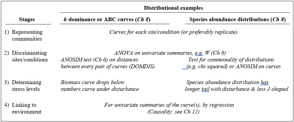
A less condensed form of diversity summary for each sample is offered by distributional/graphical methods, outlined for the four stages in Table 1.3.
Representation is by curves or histograms (Chapter 8), either plotted for each replicate sample separately or for pooled data within sites or conditions. The former permits a visual judgement of the sampling variation in the curves and, as with diversity indices, replication is required to discriminate sites, i.e. test the null hypothesis that two or more sites (/conditions etc.) have the same curvilinear structure. One approach to testing is to summarise each replicate curve by a single statistic and apply ANOVA as before: for the ABC method the W statistic (Chapter 8) measures the extent to which the biomass curve ‘dominates’ the abundance curve, or vice-versa. This is simply one more diversity index but it can be an effective supplement to the standard suite (richness, evenness etc), because it is seen to capture a ‘different axis’ of information in a multivariate treatment of multiple diversity indices (see the end of Chapter 8). For k-dominance or SAD curves, pairwise distance between replicate curves† can turn testing into exactly the same problem as that for fully multivariate data and the ANOSIM tests of Chapter 6 can then be used.
The distributional and graphical techniques have been proposed specifically as a way of determining stress levels. For the ABC method, the strongly polluted (/disturbed) state is indicated if the abundance k-dominance curve falls above the biomass curve throughout its length (e.g. Fig. 1.4): the phenomenon is linked to the loss of large-bodied ‘climax’ species and the rise of small-bodied opportunists. Note that the ABC method claims to give an absolute measure, in the way that disturbance status is indicated on the basis of samples from a single site; in practice, however, it is always wise to design collection from (matched) impacted and control sites to confirm that the control condition exhibits the undisturbed ABC pattern (biomass curve above the abundance curve, throughout).
Similarly, the species abundance distribution has features characteristic of disturbed status (e.g. see the middle plots in Fig. 1.6), namely a move to a less J-shaped distribution by a reduction in the first one or two abundance classes (loss of rarer species), combined with the gain of some higher abundance classes (very numerous opportunist species).
The distributional and graphical methods may thus have particular merits in allowing stressed conditions to be recognised, but they are limited in sensitivity to detect environmental change (Chapter 14). This is also true of linking to environmental data, which needs the curve(s) for each sample to be reduced to a summary statistic (e.g. W), single statistics then being linked to an environmental set by multiple regression.¶
† This uses the PRIMER DOMDIS routine for k-dominance plots, page 8.5, as in Clarke (1990) , with a similar idea applicable to SAD curves or other histogram or cumulative frequency data. This will be generally more valid than Kolmogorov-Smirnov or $\chi ^ 2$ type tests because of the lack of independence of species in a single sample. A valid alternative is again to calculate a univariate summary from each distribution (location or spread or skewness), and test as with any other diversity index, by ANOVA tests.
¶ As for the discussion on diversity indices (Table 1.1), if such univariate summaries from curves are added to other diversity indices then all could be entered into multivariate ANOSIM and BEST/linkage analyses, as for community data (Chapters 6, 11).