17.9 Joint (AvTD, VarTD) analyses
The histogram and funnel plots of Figs. 17.7 and 17.8 are univariate analyses, concentrating on only one index at a time. Also possible is a bivariate approach in which ($\Delta ^ +$, $\Lambda ^ +$) values are considered jointly, both in respect of the observed outcomes from real data sets and their expected values under subsampling from a master species inventory. Fig. 17.15 shows the results of a large number of random selections of m = 100 species from the 395 in the UK nematode list {U}; each selection gives rise to an (AvTD, VarTD) pair and these are graphed in a scatter plot (Fig. 17.15a). Their spread defines the ‘expected’ region (rather than range) of distinctness behaviour, for a sublist of 100 species. Superimposed on the same plot are the observed ($\Delta ^ +$, $\Lambda ^ +$) pairs for three of the studies with list sizes of about that order: all three (Clyde, Liverpool Bay and Scilly) are seen to fall outside the expected structure, though in different ways, as previously discussed.
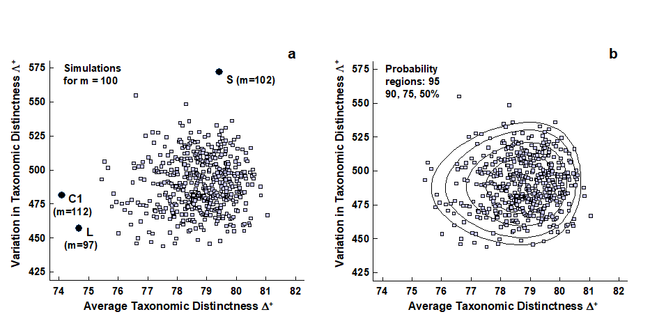
Fig. 17.15. UK regional study, free-living nematodes {U}. a) Scatter plot of (AvTD, VarTD) pairs from random selections of m = 100 species from the UK nematode list of 395; also superimposed are three observed points: Clyde (C1), Liverpool Bay (L) and Scilly (S), all falling outside ‘expectation’. b) Probability contours (back-transformed ellipses) containing approximately 95, 90, 75 and 50% of the simulated values. Both plots are based on 1000 simulations though only 500 points are displayed, for clarity.
‘Ellipse’ plots
It aids interpretation to construct the bivariate equivalent of the univariate 95% probability limits in the histogram or funnel plots, namely a 95% probability region, within which (approximately) 95% of the simulated values fall. An adequate description here is provided by the ellipse from a fitted bivariate normal distribution to separately transformed scales for $\Delta ^ +$ and $\Lambda ^ +$.
AvTD in particular needs a reverse power transform to eliminate the left-skewness though, as previously noted, any transformation of VarTD can be relatively mild, if needed at all. Clarke & Warwick (2001) discuss the fitting procedure in detail¶ and Fig. 17.15b shows its success in generating convincing probability contours, containing very close to the nominal levels of 50, 75, 90 and 95% of simulated data points. In the normal convention, the ‘expected region’ is taken as the outer (95%) contour, which is an ellipse on the transformed scales, though typically ‘egg-shaped’ when back-transformed to the original ($\Delta ^ +$, $\Lambda ^ +$) plot.
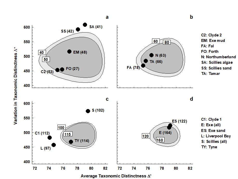
Fig. 17.16. UK regional study, free-living nematodes {U}. ‘Ellipse’ plots of 95% probability regions for (AvTD, VarTD) pairs, as for Fig. 17.15 but for a range of sublist sizes: a) m = 40, 50; b) m = 60, 80; c) m = 100, 115; d) m = 120, 160. The observed ($\Delta ^ +$, $\Lambda ^ +$) values for the 14 location/habitat studies are superimposed on the appropriate plot for their particular species list size (given in brackets). As seen in the separate funnel plots (Figs. 17.8 and 17.14), Clyde, Liverpool Bay, Fal (borderline) and all the Isles of Scilly data sets depart significantly from expectation.
A different region needs to be constructed for each sublist size or, in practice, for a range of m values, straddling the observed sizes. It may improve clarity to plot the regions in groups of two or three, as in Fig. 17.16. The conclusions are largely unchanged here, perhaps querying the need for a bivariate approach. However, there are at least three advantages to this:
-
A bivariate test naturally compensates for repeated testing which is inherent in separate univariate tests.
-
The ‘failure to reject’ region of the null hypothesis, inside the simulated 95% probability contour, is not rectangular, as it would be for two separate tests. This opens the possibility for other faunal groups, where simulated $\Delta ^ +$ and $\Lambda ^ +$ values may be negatively correlated (as appears to happen for components of the macrobenthos, Clarke & Warwick (2001) ), that significance could follow from the combination of moderately low AvTD and VarTD values, where neither of them on their own would indicate rejection.
-
It aids interpretation of spatial biodiversity patterns to know whether there is any intrinsic, artefactual correlation to be expected between the two indices, resulting from the fact that they are both calculated from the same set of data. Here, Fig. 17.15 shows emphatically that no such internal correlation is to be expected (though, as just commented, the independence of $\Delta ^ +$ and $\Lambda ^ +$ is not a universal result, and needs to be examined by simulation for each new master list). Yet the empirical correlation between $\Delta ^ +$ and $\Lambda ^ +$ for the 14 studies is not zero but large and positive (Fig. 17.17). This implies a genuine correlation from location to location in these two assemblage features, which it is legitimate to interpret. The suggestion ( Clarke & Warwick (2001) ) is that pollution may be connected with a loss both of the normal wide spread of higher taxa (reduced $\Delta ^ +$), and that the higher taxa lost are those with a simple subsidiary structure, represented only by one or two species, genera or families, leaving a more balanced tree (reduced $\Lambda ^ +$).
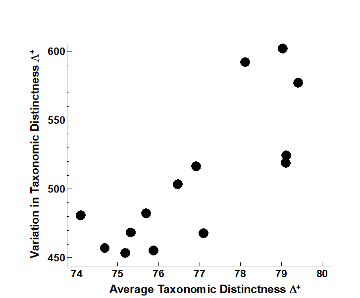
Fig. 17.17. UK regional study, free-living nematodes {U}. Simple scatter plot of observed (AvTD, VarTD) values for the 14 location/ habitat studies, showing the strongly positive empirical correlation (Pearson r = 0.79), which persists even if the three Scilly values are excluded (r = 0.75).
¶ Accomplished by the PRIMER TAXDTEST routine, which automatically carries out the simulations and transformation/fitting of bivariate probability regions to obtain (transformed) ‘ellipse’ plots, for specified sublist sizes, on which real data pairs ($\Delta ^ +$, $\Lambda ^ +$) may be superimposed. Another variation introduced into TAXDTEST in later versions of PRIMER is to generate the model histograms, funnels etc for the ‘expected’ AvTD, VarTD not by assembling species by simple random picks from the master list, but by selecting species proportionally to their frequency of occurrence in a master data matrix (which will often be just the set of all samples in the study) – it can be argued that this provides a more realistic null hypothesis against which to compare the observed relatedness. The mean AvTD line is no longer quite independent of S (though dependence is weak) but funnels can be generated in just the same way – they may move slightly up or down the y axis, but again this modelling in no way changes the observed indices.