4.5 Example: Dosing experiment, Solbergstrand mesocosm
An example of this final point for a real data set can be seen in Fig. 4.2. This is of nematode data for the dosing experiment {D} in the Solbergstrand mesocosms, at the GEEP Oslo Workshop ( Bayne, Clarke & Gray (1988) ). Box core samples were collected from Oslofjord and held for three months under four dosing regimes: control, low, medium, high doses of a hydrocarbon and Cu contaminant mixture, continuously dosed to the basin waters. Four replicate box cores were subjected to each treatment and at the end of the period cores for all 16 boxes were examined for nematode communities (amongst other faunistic components). Fig. 4.2 shows the resulting PCA, based on log-transformed counts for 26 nematode genera. The interest here, of course, is in whether all replicates from one of the four treatments separate out from other treatments, which might indicate a change in community composition attributable to a directly causal effect of the PAH and Cu contaminant dosing. A cursory glance suggests that the high dose replicates (H) may indeed do this. However, closer study shows that the % of variance explained by the first two PC axes is very low: 22% for PC1 and 15% for PC2. The picture is likely to be very unreliable therefore, and an examination of the third and higher PCs confirms the distortion: some of the H replicates are much further apart in the full species space than this projection into two dimensions would imply. For example, the right-hand H sample is actually closer to the nearest M sample than it is to other H samples. The distances in the full species space are therefore poorly-preserved in the 2-dimensional ordination.
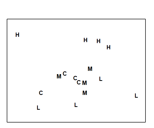
Fig. 4.2. Dosing experiment, Solbergstrand {D}. 2-dimensional PCA ordination of log-transformed nematode abundances from 16 box cores (4 replicates from each of control, low, medium and high doses of a hydrocarbon and Cu contaminant mixture). PC1 and PC2 account for 37% of the total variance.
This example is returned to again in Chapter 5, Fig. 5.5, where it is seen that an MDS of the same data under a more appropriate Bray-Curtis dissimilarity makes a better job of ‘dissimilarity preservation’, though the data is such that no method will find it easy to represent in two dimensions. The moral here is clear:
a) be very wary of interpreting any PCA plot which explains so little of the total variability in the original data;
b) statements about apparent differences in a multivariate community analysis of one site (or time or treatment) from another should be backed-up by appropriate statistical tests; this is the subject of Chapter 6.