5.8 Further nMDS/mMDS developments
Higher dimensional solutions
MDS solutions can be sought in higher dimensions and we noted previously that the stress will naturally decrease as the dimension increases. Fig 5.9a shows the scree plot of this decreasing stress (y axis) against the increasing number of dimensions, for the Amoco-Cadiz oil spill data of Fig. 5.8. There is a suggestion of a ‘shoulder’ in this line plot as the stress drops from 2-d to 3-d, thereafter declining steadily. The 2-d stress is already a rather satisfactory 0.09 but drops quite strongly to about 0.05 with the extra dimension, now in our category of an excellent representation, and so should certainly be further examined. Figs. 5.9c and d show the 2- and 3-d Shepard plots, and it is clear that the stress (scatter about the fitted monotonic regression line) has reduced quite sharply. Fig. 5.9b shows the 3-d nMDS itself, with the box rotated to highlight, in the vertical direction (z), the third MDS axis (as defined by the automatic rotation of the configuration to principal axes). The seasonal cycle is clearly expressed by changes along this axis, which is orthogonal to the main inter-annual changes seen in the x, y plane (the latter is very likely to be the effect of the oil spill and partial recovery, though it is impossible of course to infer that with full confidence, given the absence of any sort of reference conditions for the natural inter-annual variation). This example suggests that, even in cases with acceptable 2-d stress, at least the 3-d solution should be calculated and then rotated to see if it offers further insight†. Here, for example, the apparent synchrony in direction of the seasonal cycle between the start (A-E) and end (R-U) years of this time course, seen in the 2-d plot (Fig. 5.8a), is confirmed in the 3-d plot (Fig. 5.9b) with its more complete separation of season and year. The 3-d plot gives us greater confidence in this case that the 2-d plot (with its perfectly acceptable stress level) in no way misleads. Of course, for static displays, one would then always prefer the 2-d plot, as a suitable approximation to the high-dimensional structure.
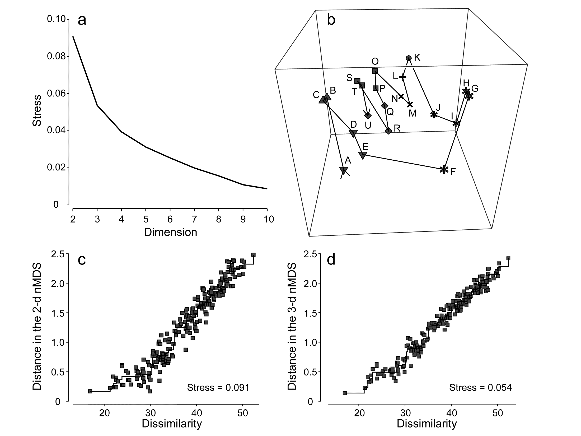
Fig. 5.9. Amoco-Cadiz oil spill {A}. a) Scree plot of stress for nMDS solutions in 2-d to 10-d (data matrix as in Fig. 5.8); b) 3-d nMDS plot for the 21 times; c) & d) Shepard plots for the 2-d (Fig 5.8) and 3-d MDS ordinations showing the decreasing scatter about the monotonic regression (stress).
(Non-)linearity of the Shepard diagram
Shepard diagrams for the 2-d and 3-d non-metric MDS ordinations for Morlaix were seen in Figs. 5.9c and 5.9d; note how relatively restricted the range of (dis)similarities is, by comparison with the equivalent plot (Fig. 5.2) for the (spatial) Exe nematode study. The latter exemplifies a long baseline of community change: there are pairs of sites with no species in common, thus dissimilarities at the extreme of their range (100). For the (temporal) Morlaix study, the baseline of change is relatively much shorter, nearly all dissimilarities being between 20 and 50: there is no complete turnover of species composition through time, nor anything approaching it. This difference results in a (commonly observed) effect of greater linearity of the relationship between original dissimilarity and final distance in the MDS plots, as seen in Figs. 5.9c&d. It is linear regression of the Shepard plot distances vs. dissimilarities, through the origin, which is the basis of a less-commonly used technique for MDS, metric multidimensional scaling (mMDS), in which dissimilarities are treated as if they are, in reality, distances. Through the origin is an important caveat here and it is clear that Figs. 5.9c&d would not be well-fitted by such a regression – the natural line through these points passes through distance y = 0 at about a dissimilarity of x = 20. Thus the flexible nMDS fits instead more of a threshold relationship, in which the linearity tails off smoothly in a compressed set of distances for the smallest dissimilarities.
Metric multi-dimensional scaling (mMDS)
The above example will be returned to later, but there are situations in which a simple linear regression on the Shepard plot is certainly appropriate, e.g. when the resemblance coefficient is Euclidean distance, as would be the case for analysis of (normalised) environmental variables. Then mMDS becomes a viable alternative to PCA (which also uses distances that are Euclidean) but with the great advantage of ordination which does not resort to a projection of the higher-dimensional data but sets out to preserve the high-d distances in the low-d plot, as closely as it can. This lack of distance preservation was one of the two main objections to PCA discussed at the end of Chapter 4.
The metric MDS algorithm is in principle that earlier described for nMDS, replacing the step involving monotonic regression with simple linear regression through the origin. This allows the distances on the mMDS plot to be scaled in the same units as the input resemblance matrix (usually a distance measure), and there are now therefore measurement scales on the axes of the plot. Orientation and reflection are again arbitrary (though usually the convention is adopted as for nMDS, of rotating co-ordinates to principal axes).
Table. 5.2. World map {W}. a) Distance (in miles) between pairs of ‘European’ cities; b) rank distances (1= closest, 21 = furthest)
| (a) | London | Madrid | Moscow | Oslo | Paris | Rome |
|---|---|---|---|---|---|---|
| London | ||||||
| Madrid | 774 | |||||
| Moscow | 1565 | 2126 | ||||
| Oslo | 723 | 1474 | 1012 | |||
| Paris | 215 | 641 | 1542 | 822 | ||
| Rome | 908 | 844 | 1491 | 1253 | 689 | |
| Vienna | 791 | 1122 | 1033 | 848 | 648 | 477 |
| (b) | London | Madrid | Moscow | Oslo | Paris | Rome |
|---|---|---|---|---|---|---|
| London | ||||||
| Madrid | 7 | |||||
| Moscow | 20 | 21 | ||||
| Oslo | 6 | 17 | 13 | |||
| Paris | 1 | 3 | 19 | 9 | ||
| Rome | 12 | 10 | 18 | 16 | 5 | |
| Vienna | 8 | 15 | 14 | 11 | 4 | 2 |
A simple example illustrates metric MDS well, that of recreating a map of cities from a triangular matrix of the road/rail/air distances (or perhaps travel times) between every pair of them, {W} ¶. Table 5.2a gives the great-circle distances between only 7 cities (called European for brevity though they include Moscow). The negligible curvature of the earth over the range of about 2000 miles makes it clear that this distance matrix should be enough to locate these cities on a 2-dimensional map near-perfectly, and Fig. 5.10a shows the result of the metric MDS. As can be seen from Fig. 5.10c, the Shepard diagram is now precisely a linear fit through the origin, with no scatter and thus zero stress (stress is defined exactly as for nMDS, equation 5.1). The mMDS has been manually rotated to align with the conventional N-S direction for such a map, though that is clearly arbitrary; the axis scales are in miles since the fully metric information is used.
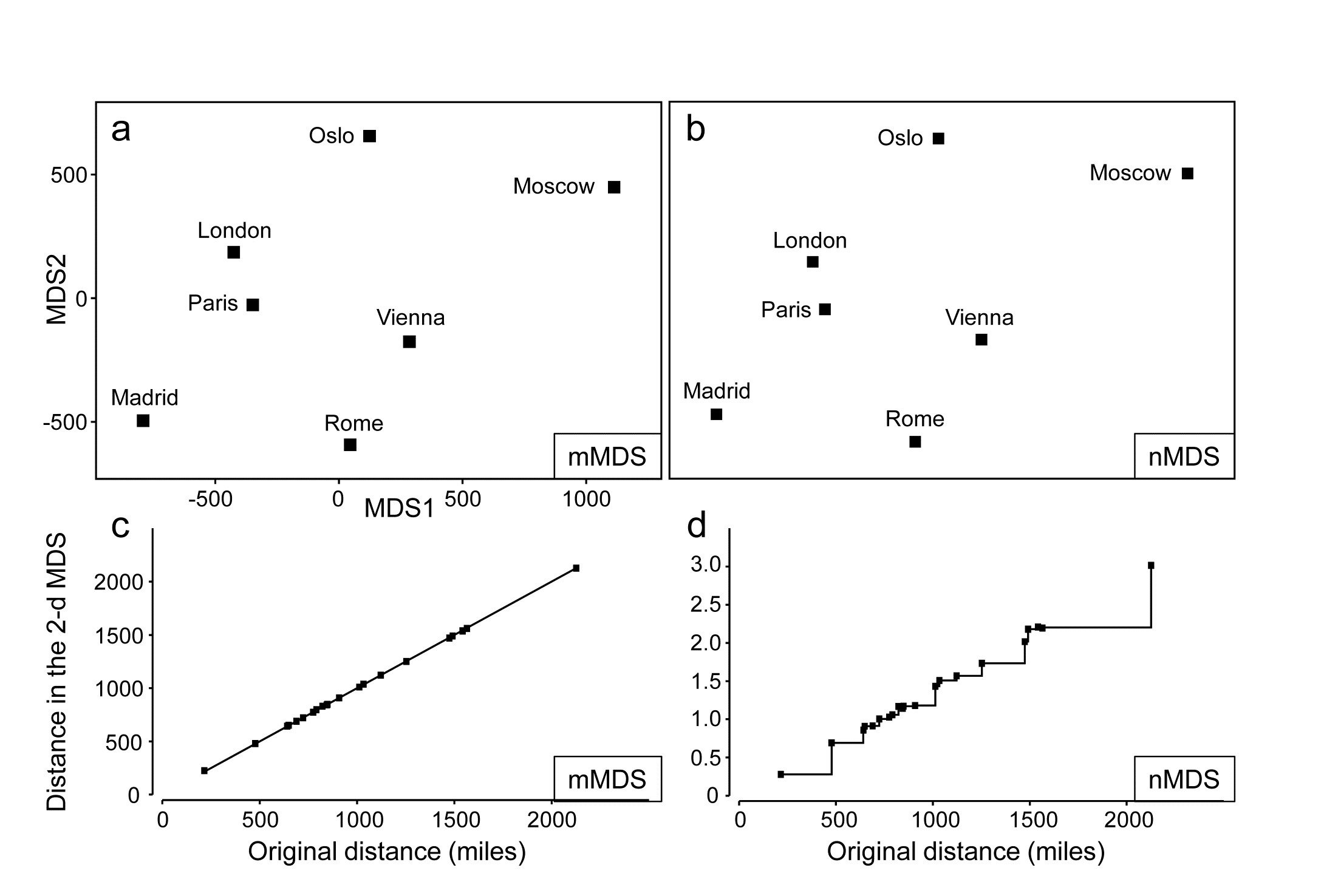
Fig. 5.10. World map {W}. For the distance matrix Table 5.2a & b from 7 ‘European’ cities: a&c) metric MDS and its associated Shepard plot; b&d) non-metric MDS and Shepard plot (stress = 0 in all cases)
Perhaps more striking is the equivalent nMDS, Fig. 5.10b, which is more or less identical. Though the Shepard diagram, Fig. 5.10d, is given in terms of distance in the ordination against the input resemblances (city distances), the monotonic regression fit ensures that all that matters to the stress (see equation 5.1) are the y axis values of ordination distances, and their departure from the fitted step function (also zero throughout). Points on the x axis could be stretched and squeezed differentially along its length, and the step function would stretch and squeeze with them, thus leaving the stress unchanged (zero, here). In other words, the only information used by the nMDS is the rank orders of city distances in Table 5.2b. And that is actually quite remarkable: a near-perfect map has been obtained solely from all possible statements of the form ‘Oslo is closer to Paris than Madrid is to Rome’. The general suitability of nMDS comes from the fact that it can accommodate not just very non-linear Shepard diagrams but, also, where a straight line is the best relationship (and there are more than a minimal number of relationships to work with) nMDS should find it: the points in Fig. 5.10d do effectively fall on a straight line through the origin. What the monotonic regression loses is the link to the original measurements: the y axis scale is in arbitrary standard deviation units, and nMDS plots have no axis scales that can be related to the original distances.
This example becomes more interesting still when we expand the data to 34 cities from all around the globe, again utilising the great-circle (‘direct flight’) inter-city distances from the same atlas source. Fig. 5.11a shows the nMDS solution in 3-d, and it is again near-perfect, with zero stress. There is one subtlety here that should not be missed: the supplied great-circle distances are not the same as the direct (‘through the earth’) distances between cities, represented in the nMDS plot, and the relationship between the two is not linear. This is clear from the Shepard diagram, Fig. 5.11d: nMDS is able to preserve the rank orders of great-circle distances perfectly in the final 3-d direct distances only if it can non-linearly transform the supplied distance scale, i.e. ‘squash up’ the larger distances, where the earth’s curvature matters more than for the smaller distances within a region. It has not been told how to do this, it does not use any form of parametric relationship to do it – it simply uses the flexibility of fitting an increasing step function to mould itself to a shape that will ‘square this particular circle’, and thus reduce the stress (to zero, here). In comparison, mMDS will also make a reasonable job of this ordination (the final plot is not very different than Fig 5.11a) but, because it must fit a straight line to the Shepard plot, the stress is not zero but 0.07.
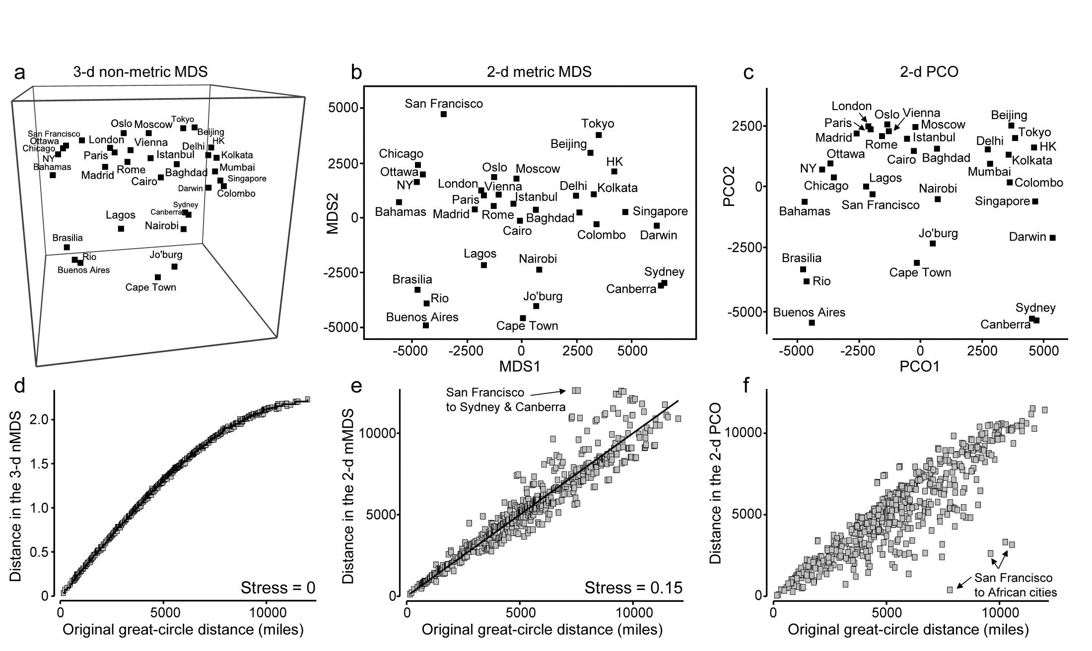
Fig. 5.11. World map {W}. a&d) 3-d non-metric MDS from great-circle distances between every pair of 34 world cities, and associated Shepard plot of (‘through the earth’) distances in the 3-d plot, y, against original great-circle distances, x (stress = 0); and for the same data: b&e) 2-d metric MDS and Shepard plot (stress = 0.15); c&f) 2-d PCO and Shepard plot (stress undefined for this technique, since not based on a modelled distance vs. resemblance relation, but the scatter is clearly greater for plot f than plot e).
In addition to turning ‘distance’ matrices into ‘maps’, the other crucial role for ordination methods is, of course, dimensionality-reduction. This can be well illustrated by seeking a 2-d MDS of the great-circle distances. Figs. 5.11b&e show the mMDS plot and associated Shepard diagram. The stress is, naturally, higher, at about 0.15. (The nMDS ‘map’, given by Clarke (1993) , looks very similar because the Shepard plot is close to linearity in this case, and has a slightly lower stress of 0.14). We previously categorised such stress values as ‘potentially useful but with detail not always accurate’, and this is an apt description of the 2-d approximation in plot b) to the true 3-d map of a). The placement within most regions (denoted by different symbols on the map) is accurate, as can be seen from the tight scatter in the Shepard plot for smaller distances, but the MDS has trouble placing cities like San Francisco – it cannot be put on the extreme left of the plot since that implies that the largest distances in the original matrix are from there to the far-eastern cities of Beijing, Tokyo, Sydney etc, which is clearly untrue. So the n/mMDS drags San Francisco towards those cities whilst keeping it away from eastern USA and Europe, which can only ever partly succeed – it is no surprise to observe therefore that the worst outliers on the Shepard plot involve San Francisco.
Nonetheless, the mMDS does give a reasonably fair 2-d map of the world and the advantage it can have over its natural competitor, Principal Co-ordinates (PCO) is well illustrated in the PCO ordination, Fig. 5.11c. PCO does its dimensionality reduction here by projecting from the 3-d space to the ‘best’ 2-d plane (‘squashing the earth flat’, in effect). San Francisco is now uncomfortably close to Lagos and the generally poor distance preservation is evident from a Shepard plot, Fig. 5.11f§, for which the most extreme outliers are, not surprisingly, between San Francisco and the African cities. In defence of PCO, it does not set out to preserve distances. Its strengths lie elsewhere, in attempting to partition meaningful structure, seen on the primary axes, from meaningless residual variability, which it assumes will appear on the higher axes and thus be ‘flattened’ by the projection. However, this example is a salutary one if the main motivation is to display all of the high-dimensional structure of a resemblance matrix in the best possible way in low-dimensional space.
mMDS for Amoco-Cadiz oil-spill data
Fig. 5.12a shows the result of metric MDS for the Morlaix macrofauna data of Figs. 5.8 and 5.9. Whilst the metric ordination plot shares the same features as its non-metric counterpart, the stress value is much higher (at 0.23). Fig. 5.12c shows why: the linear regression through the origin, the basis of mMDS, is a very poor fit. In spite of the way mMDS is seeking to force the Bray-Curtis dissimilarities to be interpreted exactly as distances, the data resolutely refuses to go along with this! It maintains its own linear relationship (not through the origin) as the solution which best minimises the overall stress; this explains the retention of a similar-looking ordination in spite of the high stress. But the conflict between the fitted model and the data carries a price: it does not result in an adequate 2-d representation. For example, it suggests that the apparent ‘recovery’ towards the pre-spill year is better than is justified by the similarities. Also the only significant advantage of a successful mMDS here, that the axis scales could then be read as Bray-Curtis dissimilarities, is entirely nullified. The ordination scale suggests that times G and O (the first week of August in 1978 and 1980) are separated by a distance (=dissimilarity) of nearly 70, yet the real value is around 50; this is a direct result of the way the points form a steeper gradient than the fitted line in Fig. 5.12c. What this figure strongly suggests, in fact, is that we can retain a linear relationship of distance with dissimilarity, using what we shall term a threshold metric MDS (tmMDS), by fitting a linear regression to the Shepard plot but with a non-zero intercept (this is an option in PRIMER7’s mMDS).
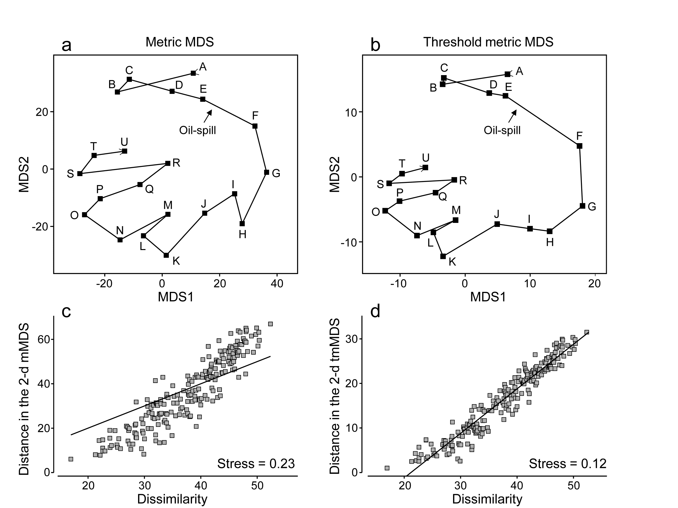
Fig. 5.12. Amoco-Cadiz oil-spill {A}. a&c) mMDS for 21 sampling times (data as Fig. 5.8) and Shepard plot (stress 0.23); b&d) threshold mMDS and Shepard plot (stress 0.12)
The resulting tmMDS and Shepard plot are shown in Fig. 5.12 b&d. The model is seen to fit very well and the stress greatly reduces, to a very acceptable 0.12, (not much higher than the vastly more flexible step function of nMDS, with stress 0.09). The resulting ordination is now virtually identical to the 2-d nMDS, Fig. 5.8a, and because the linear threshold model in Fig. 5.12d fits the dissimilarities so accurately and tightly, we are justified in interpreting the distance scales on the mMDS axes as dissimilarities, after one adjustment. Dissimilarities of about 20, the intercept on the x axis in the Shepard plot, are represented in the ordination by zero distance, i.e. the points for those samples would effectively coincide (samples B and C are a case in point, with dissimilarity of 17, the lowest in the matrix). Points G and O are now separated by about 30 units on the mMDS axes, so their dissimilarity is represented as being 20+30 = 50 (and their true dissimilarity is a slightly fortuitous 49.9!)
Reference was made earlier to the way PCO and PCA hope to display meaningful structure on the first few axes and remove smaller-scale sampling variation by projecting across the higher PCs. nMDS can achieve this in a different way, by compression of the scale of smaller dissimilarities, smoothly ‘tailing in’ samples below a certain dissimilarity to be represented by points closer together on the plot than could happen under standard mMDS, where the linearity demands that only points of zero dissimilarity are coincident. Threshold mMDS, using liner regression not through the origin, is thus a combination of metric and non-metric ideas: points below some fitted threshold of dissimilarity (20 here) are literally placed on top of each other, so what could be just sampling variation (e.g. among replicates at the same point in space or time or treatment combination) is eliminated in that way. Above the threshold, strict linearity is enforced, so such a threshold mMDS is not well-suited to many cases which have long baseline gradients of assemblage change (such as Fig. 5.2) where samples have few or no species in common and dissimilarities abut 100. Where the Shepard plot shows them to be accurate models, with low stress, mMDS and threshold mMDS bring the advantage of interpretable axis scales for the MDS plot; where they are less accurate, nMDS is usually much preferable.
Combined nMDS and mMDS ordinations
The combination of non-metric and metric concepts can be taken one logical step further‡, to tackle a problem raised on page 5.2, which can occur with nMDS, that of degenerate solutions with zero stress arising from the collapse of the ordination into two (or a small number of) groups, in cases where among- group dissimilarities are all uniformly larger than any within-group ones. The non-metric algorithm can then place such groups infinitely far apart (in effect) and the display of any real within-group structure is lost as they collapse to points. The problem does not arise at all for standard mMDS (or PCO/PCA) since positioning of the most distant samples is constrained by the simple linear relation with smaller distances.
In cases of collapse where there are very few points in the ordination in the first place, an mMDS solution is an obvious place to start. In an extreme case, e.g. when ordinating only 3 points, nMDS will not run at all (the only data available to it are the three ranks 1, 2, 3!). Such cases are not pathological – they arise very naturally when looking at the equivalent of ‘means plots’ for multivariate analyses. Just as in univariate analyses, where an ANOVA is followed by plots of the means, e.g. ‘main effects’ of a factor, so in multivariate analysis, ANOSIM or PERMANOVA tests are followed by ordinations of the averages or centroids of the factor levels, to interpret the relationships among groups that have been demonstrated by tests at the replicate level. Such plots can sometimes have very few points and mMDS can then provide an effective, low stress, solution to displaying them.
However, for less trivial numbers of points, and in the common cases where Shepard plots are non-linear and the flexibility of nMDS is required, an effective solution to ‘collapsing plots’ is to combine mMDS and nMDS stress functions over all dissimilarities, in mixing proportions of (say) 0.05 and 0.95.
† PRIMER v7 also offers a dynamic display of the ‘evolution’ of a community in 3-d MDS space, typically over a time course. This is unnecessary for Fig 5.9b because there are only 21 points and they do not tread similar paths at later times, but the continued study of the macrobenthos at station ‘Pierre Noire’ in Morlaix Bay over three decades has given rise to a data set of nearly 200 time steps and a complex, multi-layered 3-d plot; it is then fascinating to watch the evolving trajectory of newer samples over the fading background of older community samples, and thus to set the potential oil-spill effects in the context of longer-term inter-annual patterns.
¶ Such examples are very useful in explaining the purpose and interpretation of ordinations to the non-specialist and are quite commonly found (e.g. Everitt (1978) starts from a road distance matrix for UK cities; Clarke (1993) uses the example in this chapter of great-circle distances between world cities, taken from the Reader’s Digest Great World Atlas of 1962).
§ Note that, though a Shepard diagram is not normally produced by a PCO, it can be created in PRIMER7 (with PERMANOVA+) by saving the 2-d PCO co-ordinates to a worksheet, calculating the Euclidean distances, using Unravel to generate a single y axis column, and likewise for the original distances (x), and running a Scatter Plot of y on x. Note also that PCO looks close to being PCA here, but is not – great-circle distances are not Euclidean.
‡ Though not implemented in the same way as in the PRIMER7 ‘Fix Collapse’ option, and with different motivation, the hybrid scaling (HS) technique of Faith, Minchin & Belbin (1987) , and the semi-strong hybrid scaling (SHS) of Belbin (1991) , introduced this combination idea into ecology in the PATN software. Briefly, using the original Kruskal, Young and Seer software (KYST), which allows combined stress function optimisation, HS mixes mMDS for all dissimilarities below a specified value with nMDS on the full set of dissimilarities. SHS also uses mMDS below a specified value but mixes that with nMDS above that value (and also substitutes Guttman’s algorithm for Kruskal’s). The primary motivation is in reconstruction of ecological gradients driven environmentally on a transect or grid and the methods do not appear to be optimal for a ‘collapsing MDS’ problem, since neither applies a direct constraint to dissimilarities greater than the threshold. (E.g. they would not stop the collapse for two well-separated groups whose between-group dissimilarities all exceeded that threshold.) The approach of this section achieves this by the common metric scale imposed (very mildly) on the largest distances by smaller ones.