4.2 Principal components analysis
The starting point for PCA is the original data matrix rather than a derived similarity matrix (though there is an implicit dissimilarity matrix underlying PCA, that of Euclidean distance). The data array is thought of as defining the positions of samples in relation to axes representing the full set of species, one axis for each species. This is the very important concept introduced in Chapter 2, following equation (2.13). Typically, there are many species so the samples are points in a very high-dimensional space.
A simple 2-dimensional example
It helps to visualise the process by again considering an (artificial) example in which there are only two species (and nine samples).
| Sample | 1 | 2 | 3 | 4 | 5 | 6 | 7 | 8 | 9 | |
|---|---|---|---|---|---|---|---|---|---|---|
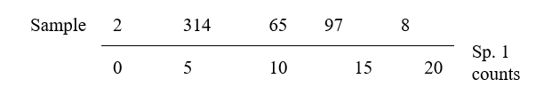
| Abundance | Sp.1 | 6 | 0 | 5 | 7 | 11 | 10 | 15 | 18 | 14 |
| Sp.2 | 2 | 0 | 8 | 6 | 6 | 10 | 8 | 14 | 14 |
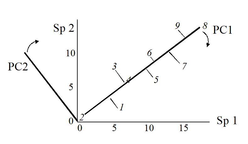
The nine samples are therefore points in two dimensions, and labelling these points with the sample number gives:
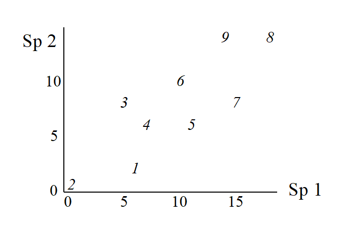
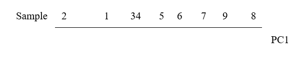
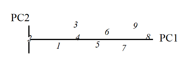
This is an ordination already, of 2-dimensional data on a 2-dimensional map, and it summarises pictorially all the relationships between the samples, without needing to discard any information at all. However, suppose for the sake of example that a 1-dimensional ordination is required, in which the original data is reduced to a genuine ordering of samples along a line. How do we best place the samples in order? One possibility (though a rather poor one!) is simply to ignore altogether the counts for one of the species, say Species 2. The Species 1 axis then automatically gives the 1-dimensional ordination (Sp.1 counts are again labelled by sample number):
(Think of this as projecting the points in the 2-dimensional space down onto the Sp.1 axis). Not surprisingly, this is a rather inaccurate 1-dimensional summary of the sample relationships in the full 2-dimensional data, e.g. samples 7 and 9 are rather too close together, certain samples seem to be in the wrong order (9 should be closer to 8 than 7 is, 1 should be closer to 2 than 3 is) etc. More intuitively obvious would be to choose the 1-dimensional picture as the (perpendicular) projection of points onto the line of ‘best fit’ in the 2-dimensional plot.
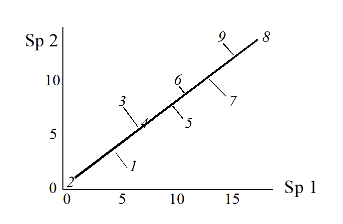
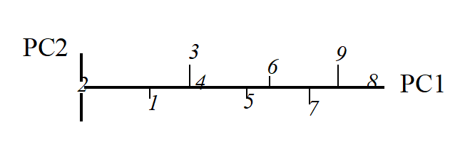
The 1-dimensional ordination, called the first principal component axis (PC1), is then:
and this picture is a much more realistic approximation to the 2-dimenensional sample relationships (e.g. 1 is now closer to 2 than 3 is, 7, 9 and 8 are more equally spaced and in the ‘right’ sequence etc).
The second principal component axis (PC2) is defined as the axis perpendicular to PC1, and a full principal component analysis then consists simply of a rotation of the original 2-dimensional plot:
to give the following principal component plot.
Obviously the (PC1, PC2) plot contains exactly the same information as the original (Sp.1, Sp.2) graph. The whole point of the procedure though is that, as in the current example, we may be able to dispense with the second principal component (PC2): the points in the (PC1, PC2) space are projected onto the PC1 axis and relatively little information about the sample relationships is lost in this reduction of dimensionality.
Definition of PC1 axis
Up to now we have been rather vague about what is meant by the ‘best fitting’ line through the sample points in 2-dimensional species space. There are two natural definitions. The first chooses the PC1 axis as the line which minimises the sum of squared perpendicular distances of the points from the line.¶ The second approach comes from noting in the above example that the biggest differences between samples take place along the PC1 axis, with relatively small changes in the PC2 direction. The PC1 axis is therefore defined as that direction in which the variance of sample points projected perpendicularly onto the axis is maximised. In fact, these two separate definitions of the PC1 axis turn out to be totally equivalent† and one can use whichever concept is easier to visualise.
Extensions to 3-dimensional data
Suppose that the simple example above is extended to the following matrix of counts for three species.
| Sample | 1 | 2 | 3 | 4 | 5 | 6 | 7 | 8 | 9 | |
|---|---|---|---|---|---|---|---|---|---|---|
| Abundance | Sp.1 | 6 | 0 | 5 | 7 | 11 | 10 | 15 | 18 | 14 |
| Sp.2 | 2 | 0 | 8 | 6 | 6 | 10 | 8 | 14 | 14 | |
| Sp.3 | 3 | 1 | 6 | 6 | 9 | 11 | 10 | 16 | 15 |
Samples are now points in three dimensions (Sp.1, Sp.2 and Sp.3 axes) and there are therefore three principal component axes, again simply a rotation of the three species axes. The definition of the (PC1, PC2, PC3) axes generalises the 2-dimensional case in a natural way:
PC1 is the axis which maximises the variance of points projected perpendicularly onto it;
PC2 is constrained to be perpendicular to PC1, but is then again chosen as the direction in which the variance of points projected perpendicularly onto it is maximised;
PC3 is the axis perpendicular to both PC1 and PC2 (there is no choice remaining here).
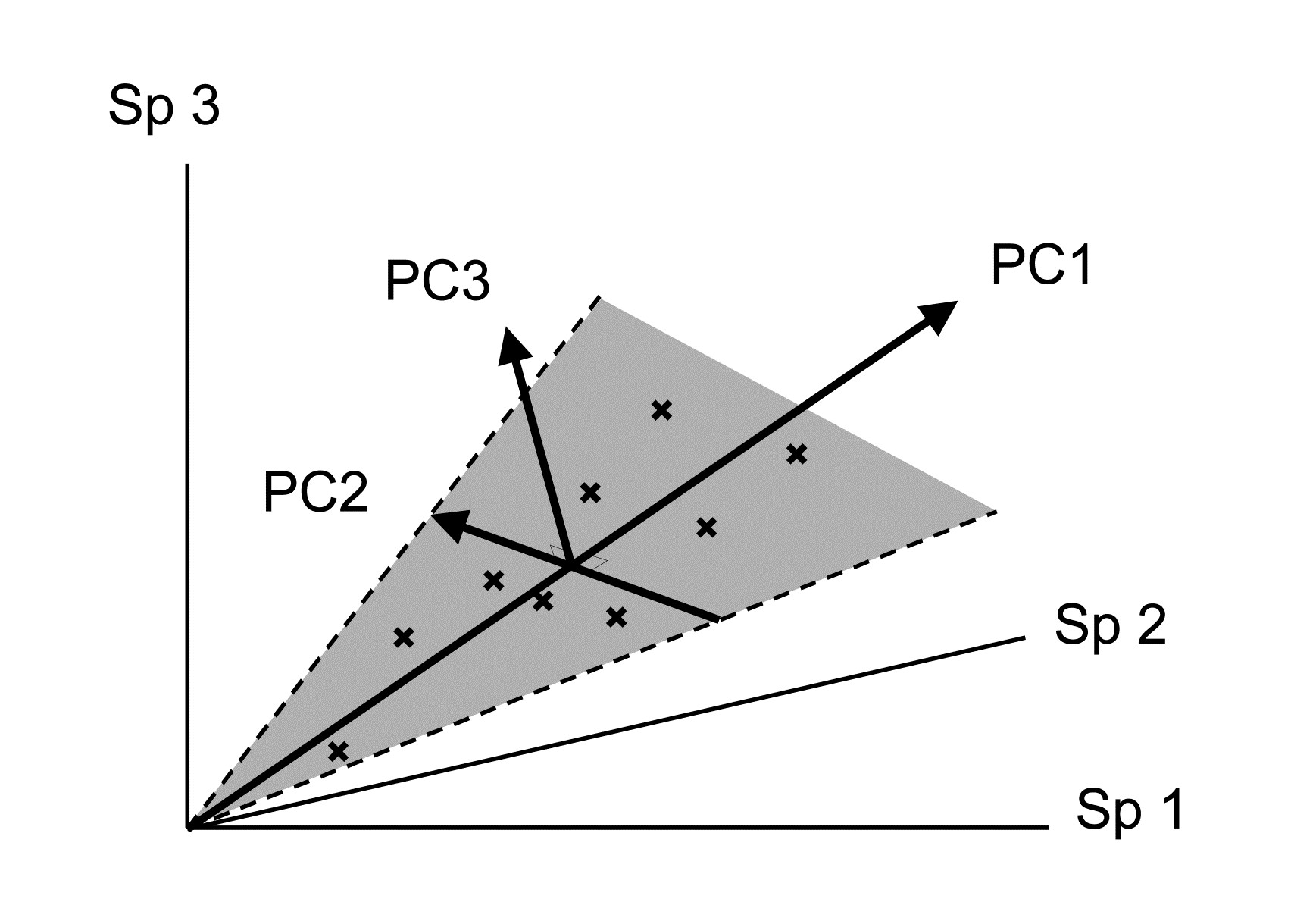
An equivalent way of visualising this is again in terms of ‘best fit’: PC1 is the best fitting line to the sample points and, together, the PC1 and PC2 axes define a plane (grey in the above diagram) which is the best fitting plane.
Algebraic definition
The above geometric formulation can be expressed algebraically. The three new variables (PCs) are just linear combinations of the old variables (species), such that PC1, PC2 and PC3 are uncorrelated. In the above example:
$$ PC1 = 0.62 \times Sp.1 + 0.52 \times Sp.2 + 0.58 \times Sp.3 $$ $$ PC2 = –0.73 \times Sp.1 + 0.65 \times Sp.2 + 0.20 \times Sp.3 \tag{4.1} $$ $$ PC3 = 0.28 \times Sp.1 + 0.55 \times Sp.2 – 0.79 \times Sp.3 $$
The principal components are therefore interpretable (in theory) in terms of the counts for each original species axis. Thus PC1 is a sum of roughly equal (and positive) contributions from each of the species; it is essentially ordering the samples from low to high total abundance. At a more subtle level, for samples with the same total abundance, PC2 then mainly distinguishes relatively high counts of Sp.2 (and low Sp.1) from low Sp.2 (and high Sp.1); Sp.3 values do not feature strongly in PC2 because the corresponding coefficient is small. Similarly the PC3 axis mainly contrasts Sp.3 and Sp.2 counts.
Variance explained by each PC
The definition of principal components given above is in terms of successively maximising the variance of sample points projected along each axis, with the variance therefore decreasing from PC1 to PC2 to PC3. It is thus natural to quote the values of these variances (in relation to their total) as a measure of the amount of information contained in each axis. And the total of the variances along all PC axes equals the total variance of points projected successively onto each of the original species axes, total variance being unchanged under a simple rotation. That is, letting var(PCi) denote variance of samples on the ith PC axis and var(Sp.i) denote variance of points on the ith species axis (i = 1, 2, 3):
$$ \sum_i var ( PCi ) = \sum_i var ( Sp.i) \tag{4.2} $$
Thus, the relative variation of points along the ith PC axis (as a percentage of the total), namely
$$ P_i = 100 \frac{ var ( PCi ) } { \sum_i var ( PCi ) } = 100 \frac{ var ( PCi ) } { \sum_i var ( Sp.i ) } \tag{4.3} $$
has a useful interpretation as the % of the original total variance explained by the ith PC. For the simple 3-dimensional example above, PC1 explains 93%, PC2 explains 6% and PC3 only 1% of the variance in the original samples.
Ordination plane
This brings us back finally to the reason for rotating the original three species axes to three new principal component axes. The first two PCs represent a plane of ‘best fit’, encompassing the maximum amount of variation in the sample points. The % variance explained by PC3 may be small and we can dispense with this third axis, projecting all points perpendicularly onto the (PC1, PC2) plane to give the 2-dimensional ordination plane that we have been seeking. For the above example this is:


and it is almost a perfect 2-dimensional summary of the 3-dimensional data, since PC1 and PC2 account for 99% of the total variation. In effect, the points lie on a plane (in fact, nearly on a line!) in the original species space, so it is no surprise to find that this PCA ordination differs negligibly from that for the initial 2-species example: the counts added for the third species were highly correlated with those for the first two species.
Higher-dimensional data
Of course there are many more species than three in a normal species by samples array, let us say 50, but the approach to defining principal components and an ordination plane is the same. Samples are now points in (say) a 50-dimensional species space§ and the best fitting 2-dimensional plane is found and samples projected onto it to give the 2-dimensional PCA ordination. The full set of PC axes are the perpendicular directions in this high-dimensional space along which the variances of the points are (successively) maximised. The degree to which a 2-dimensional PCA succeeds in representing the information in the full space is seen in the percentage of total variance explained by the first two principal components. Often PC1 and PC2 may not explain more than 40-50% of the total variation, and a 2-dimensional PCA ordination then gives an inadequate and potentially misleading picture of the relationship between the samples. A 3-dimensional sample ordination, using the first three PC axes, may give a fuller picture or it may be necessary to invoke PC4, PC5 etc. before a reasonable percentage of the total variation is encompassed. Guidelines for an acceptable level of ‘% variance explained’ are difficult to set, since they depend on the objectives of the study, the number of species and samples etc., but an empirical rule-of-thumb might be that a picture which accounts for as much as 70-75% of the original variation is likely to describe the overall structure rather well.
The geometric concepts of fitting planes and projecting points in high-dimensional space are not ones that most people are comfortable with (!) so it is important to realise that, algebraically, the central ideas are no more complex than in three dimensions. Equations like (4.1) simply extend to p principal components, each a linear function of the p species counts. The ‘perpendicularity’ (orthogonality) of the principal component axes is reflected in the zero values for all sums of cross-products of coefficients (and this is what defines the PCs as statistically uncorrelated with each other), e.g. for equation (4.1):
$$ (0.62) \times (-0.73) + (0.52) \times (0.65) + (0.58) \times (0.20) = 0 $$ $$ (0.62) \times (0.28) + (0.52) \times (0.55) + (0.58) \times (-0.79) = 0 $$ $$ etc $$
The coefficients are also scaled so that their sum of squares adds to one – an axis only defines a direction not a length so this (arbitrarily) scales the values, i.e.
$$ (0.62)^2 + (0.52)^2 + (0.58)^2 = 1$$ $$ (-0.73)^2 + (0.65)^2 + (0.20)^2 = 1$$ $$etc$$
There is clearly no difficulty in extending such relations to 4, 5 or any number of coefficients.
The algebraic construction of coefficients satisfying these conditions but also defining which perpendicular directions maximise variation of the samples in the species space, is outside the scope of this manual. It involves calculating eigenvalues and eigenvectors of a p by p matrix, see
Chatfield & Collins (1980)
, for example. (Note that a knowledge of matrix algebra is essential to understanding this construction). The advice to the reader is to hang on to the geometric picture: all the essential ideas of PCA are present in visualising the construction of a 2-dimensional ordination plot from a 3-dimensional species space.
(Non-)applicability of PCA to species data
The historical background to PCA is one of multivariate normal models for the individual variables, i.e. individual species abundances being normally distributed, each defined by a mean and symmetric variability around that mean, with dependence among species determined by correlation coefficients, which are measures of linearly increasing or decreasing relationships. Though transformation can reduce the right-skewness of typical species abundance/biomass distributions they can do little about the dominance of zero values (absence of most species in most of the samples). Worse still, classical multivariate methods require the parameters of these models (the means, variances and correlations) to be estimated from the entries in the data matrix. But for the Garroch Head macrofaunal biomass data introduced on page 1.6, which is typical of much community data, there are p=84 species and only n=12 samples. Thus, even fitting a single multivariate normal distribution to these 12 samples requires estimation of 84 means, 84 variances and $_{84} C _ 2 = 84 \times 83 / 2 = 3486$ correlations! It is, of course, impossible to estimate over 3500 parameters from a matrix with only $12 \times 86 = 1032$ entries, and herein lies much of the difficulty of applying classical testing techniques which rely on normality, such as MANOVA, Fisher’s linear discriminant analysis, multivariate multiple regression etc, to typical species matrices.
Whilst some significance tests associated with PCA also require normality (e.g. sphericity tests for how many eigenvalues can be considered significantly greater than zero, attempting to establish the ‘true dimensionality’ of the data), as it has just been simply outlined, PCA has a sensible rationale outside multi-normal modelling and can be more widely applied. However, it will always work best with data which are closest to that model. E.g. right skewness will produce outliers which will always be given an inordinate weight in determining the direction of the main PC axes, because the failure of an axis to pass through those points will lead to large residuals, and these will dominate the sum of squared residuals that is being minimised. Also, the implicit way in which dissimilarity between samples is assessed is simply Euclidean distance, which we shall see now (and again much later when dissimilarity measures are examined in more detail in Chapter 16) is a poor descriptor of dissimilarity for species communities. This is primarily because Euclidean distance pays no special attention to the role that zeros play in defining the presence/absence structure of a community. In fact, PCA is most often used on variables which have been normalised (subtracting the mean and dividing by the standard deviation, for each variable), leading to what is termed correlation-based PCA (as opposed to covariance-based PCA, when non-normalised data is submitted to PCA). After normalising, the zeros are replaced by different (largish) negative values for each species, and the concept of zero representing absence has disappeared. Even if normalisation is avoided, Euclidean distance (and thus PCA) is what is termed ‘invariant to a location change’ applied throughout the data matrix, whereas biological sense dictates that this should not be the case, if it is to be a useful method for species data. (Add 10 to all the counts in Table 2.1 and ask yourself whether it now carries the same biological meaning. To Euclidean distance nothing has changed; to an ecologist the data are telling you a very different story!)
Another historical difficulty with applying PCA to community matrices was computational issues with eigen-analyses on matrices with large numbers of variables, especially when there is parameter indeterminacy in the solution, from matrices having a greater number of species than samples (p > n). However, modern computing power has long since banished such issues, and very quick and efficient algorithms can now generate a PCA solution (with n-1 non-zero eigenvalues in the p > n case), so that it is not necessary, for example, to arbitrarily reduce the number of species to p < n before entering PCA.
¶ This idea may be familiar from ordinary linear regression, except that this is formulated asymmetrically: regression of y on x minimises the sum of squared vertical distances of points from the line. Here x and y are symmetric and could be plotted on either axis.
† The explanation for this is straightforward. As is about to be seen in (4.2), the total variance of the data, var(Sp1) + var (Sp2), is preserved under any rotation of the (perpendicular) axes, so it equals the sum of the variances along the two PC axes, var(PC1) + var(PC2). If the rotation is chosen to maximise var(PC1), and var(PC1) + var(PC2) is fixed (the total variance) then var(PC2) must be minimised. But what is var(PC2)? It is simply the sum of squares of the PC2 values round about their mean (divided by a constant), in other words, the sum of squares of the perpendicular projections of each point on to the PC1 axis. But minimising this sums of squares is just the definition given of ‘best fitting line’.
§ If there are, say, only 25 samples then all 50 dimensions are not necessary to exactly represent the distances among the 25 samples – 24 dimensions will do (any two points fit on a line, any three points fit in a plane, any four points in 3-d space, etc). But a 2-d representation still has to approximate a 24-d picture!