18.2 Example: Indonesian reef corals, S. Tikus
The point is made here in Fig 18.1 for the Shannon diversity of coral community transects (% cover data) at S. Tikus Island, Indonesia {I} first met in Fig 6.5. Normal-theory based tests are usually entirely valid for most diversity indices, often without transformation, since the normality is typically induced by the central limit theorem, most indices being a sum over a large number of species contributions. Pairwise tests show a clear diversity change in 1983, post the El Niño-induced bleaching event, and change again of the index thereafter, but still distinct from its 1981 level. This interpretation is evident from the means plot of Fig 18.1b (though it is by no means as clear in the replicate plot, 18.1a!). The means plot also allows the direct inference that, in the later years, the index is intermediate between its 1981 and 1983 levels.
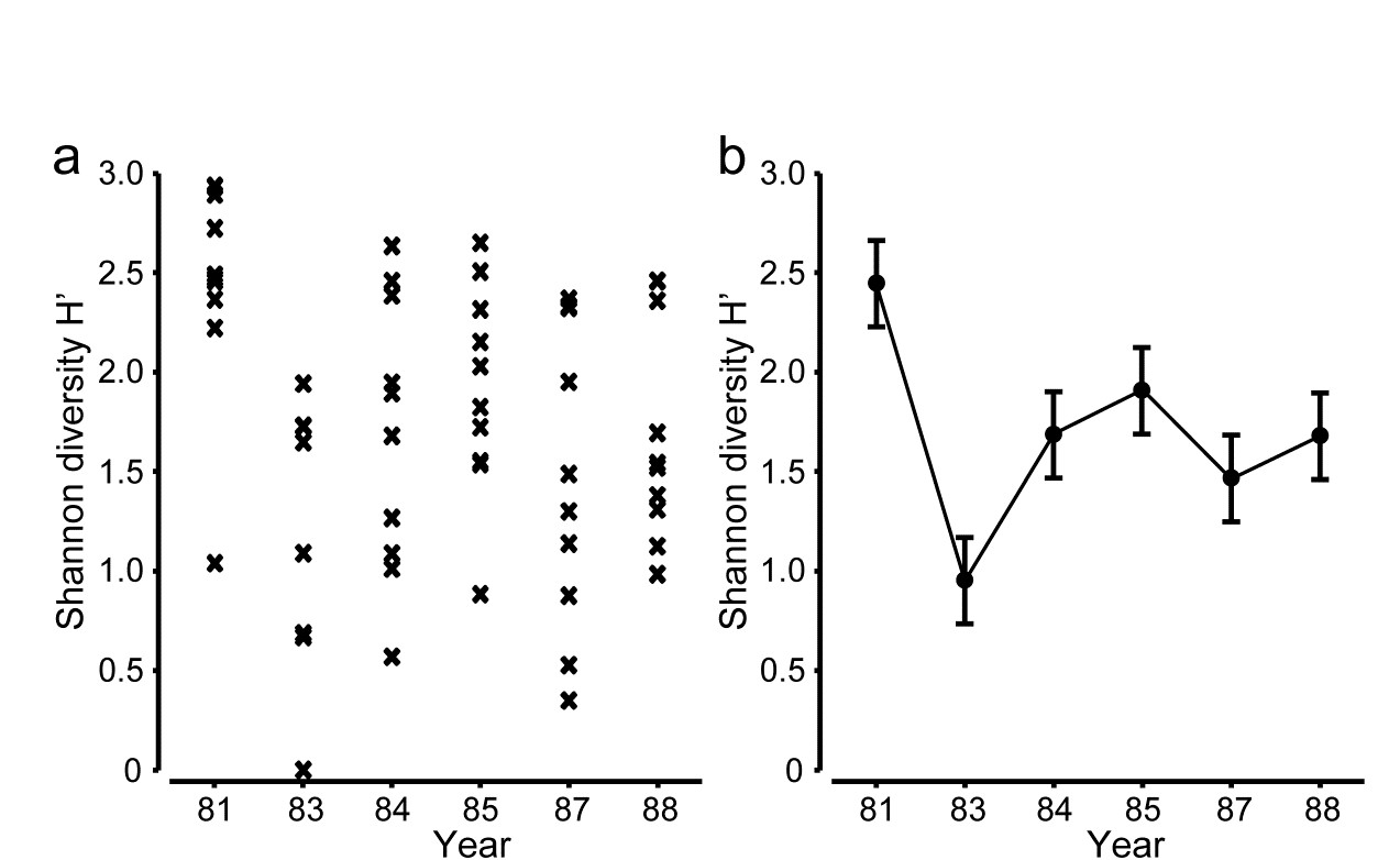
Fig. 18.1. Indonesian reef corals, S. Tikus Island {I}. a) Shannon diversity (base e) for % cover of 75 coral species on 10 replicate transects in each of 6 years, over the period 1981-1988, spanning a coral bleaching event in 1982; b) ‘means plot’ for the replicates in (a), with 95% interval estimates for mean diversity in each year.
The same pattern of analysis should be applied to the community response. Here, the appropriate similarity is the zero-adjusted Bray-Curtis (see page 16.6), on root-transformed % cover: the global ANOSIM statistic, R = 0.47, is sizeable and overwhelmingly significant. Pairwise ANOSIM values (Table 18.1) also have tests based on large numbers of permutations (92,378), a result of the 10 replicates per year, and differences are thus demonstrated between every pair of years. However, many of the pairwise R values are not just significant but substantial, ranging up to 0.87.
Table 18.1. Indonesian reef corals, S. Tikus Island {I}. Pairwise ANOSIM R statistics, from square-root transformed % cover of coral communities on 10 transects in 6 years, and zero-adjusted Bray-Curtis similarity. All years are significantly different (p < 2%), with ’81 and ’83 differing from all other years at p<0.1%.
| R | 1981 | 1983 | 1984 | 1985 | 1987 |
|---|---|---|---|---|---|
| 1983 | 0.87 | ||||
| 1984 | 0.73 | 0.43 | |||
| 1985 | 0.63 | 0.67 | 0.31 | ||
| 1987 | 0.50 | 0.64 | 0.25 | 0.33 | |
| 1988 | 0.64 | 0.54 | 0.49 | 0.30 | 0.25 |
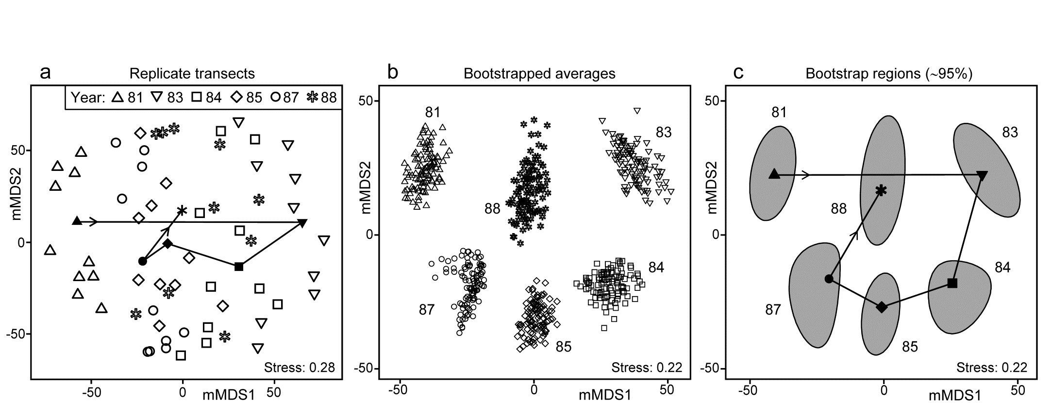
Fig. 18.2. Indonesian reef corals, S. Tikus Island {I}. a) Metric MDS (mMDS) of the coral communities on 10 transects sampled in each of 6 years, spanning a coral bleaching event in 1982, based on zero-adjusted Bray-Curtis similarities (dummy value = 1) on square-root transformed data of % cover. Also shown are the mean communities for each year (filled symbols, joined in date order), from averaging the transformed data over the 10 replicates and merging this with the transformed matrix, prior to resemblance calculation. b) mMDS of ‘whole sample’ bootstrap averages, resampling the 10 transects 100 times for each of the 6 years. c) mMDS ordination as in (b) but with approximate 95% region estimates fitted to the bootstrap averages in (b); also seen are the group means of these repeated bootstrap averages, again joined in a trajectory across years. See later text for details of precise construction in (b) and (c).
The initial, stark change in the community from ’81 to ’83 is evident from the ordination plot of replicate transects (Fig. 18.2a), and the following years can be seen to be intermediate between these extremes, but their pattern only becomes clearer when the average points for each year are also included in the plot, as closed symbols joined by a trajectory in time order. Displaying all 60 replicate points (and the means) in the same 2-d ordination, given the large degree of variability from transect to transect within a year, is in any case over-optimistic: the stress is unacceptably high. (Note that this is a metric MDS, for consistency with the following exposition, but the nMDS plot is similar and still has an uncomfortable stress of 0.21). If the averaged values are mMDS-ordinated on their own, the pattern is similar (as it is for the ‘distance among centroids’ construction¶, Anderson, Gorley & Clarke (2008) ) but what is missing in comparison with the univariate plot is some indication of reliability in the position of these averaged communities, i.e. an analogue of the interval estimates in Fig. 18.1b. What region of the 6-point mMDS would we expect each of these averages to occupy, if we had been able to take repeated sets of 10 transects from each year, computing the averaged community for each set? To attempt formal modelling of confidence regions with exact coverage properties is highly problematic for typical multivariate datasets, with their often high (and correlated) dimensionality and zero-inflated distributions. Also permutation does not provide an obvious distribution-free solution: by permuting labels of the replicates in a particular year we clearly do not construct new realisations of the averaged community for that year. But bootstrapping these replicates, resampling them with replacement, does provide a way forward without distributional assumptions, and produces bootstrap regions for the averaged communities with at least nominal coverage probabilities (subject to a number of approximations).
¶ There is an important distinction in what these two approaches are trying to achieve. ‘Distance among centroids’, in the high-d PCO space calculated from the resemblances, is trying to locate the ‘centre’ of each cloud of replicate points and then project this, potentially along with the replicates, into low-d (say 2-d) PCO space; such centroids will then be at the centre of gravity of the replicates in the 2-d PCO. Averaging of community samples, on the other hand, may not produce a sample which is ‘central’ to the replicates (though often, such as in Fig. 18.2a, it more or less does so). For example, unless species are ubiquitous, the average is likely to contain more species than most of the replicates and, if a biological similarity measure which pays much attention to presence/absence structure is chosen (Bray-Curtis under heavy transformation, Jaccard etc), then the averaged sample need not be highly similar to any of the replicates. Ecologists will be very familiar with this idea from measuring diversity by species richness (S). The average number of species in a replicate core from a location is not the same as the number of species found at that location, but both have validity as measures of richness, at different spatial scales. Similarly both ‘centroid’ and ‘average’ are interpretable constructs in this context (as a central, single community sample and a representation of the ‘pooled’ community at that location, respectively), and it is interesting to note that they often tell you an almost identical story about the relationships between the locations (/times etc).
Averages in the species space have substantial practical advantages over centroids in the resemblance space in that they do not lose the link to the individual species, thus shade plots, species bubble plots, SIMPER analyses etc are all possible with averaged community samples, and impossible with the centroids in resemblance space. Averages have a clear disadvantage of potential biases for strongly unbalanced numbers of replicates across locations, for exactly the same reasons (though usually less acutely) as in calculating species richness as the number of species observed at each location (under uneven sampling effort). If averaging in such strongly unbalanced cases, it would usually be wise to avoid severe transformations, which drag the data matrix close to presence/absence, and to check whether the final ordination shows a pattern linked to replicate numbers making up each group average. A useful graph is an ordination bubble plot, in which the circles (or spheres) have sizes representing numbers of samples making up each ordination point. Tell-tale signs of potential bias problems are often where points at the extremities of an ordination are all averages involving low sample sizes.