8.3 Examples: Garroch Head and Ekofisk macrofauna
Plots of geometric abundance classes along a transect across the Garroch Head {G} sewage-sludge dump site (Fig. 8.3) are given in Fig. 8.4. Note that the curves are very steep at both ends of the transect (the relatively unpolluted stations) with many species represented by only one individual, and they extend across very few abundance classes (6 at station 1 and 3 at station 12). As the dump centre at station 6 is approached the curves become much flatter, extending over many more abundance classes (13 at station 7), and there are fewer rare species.
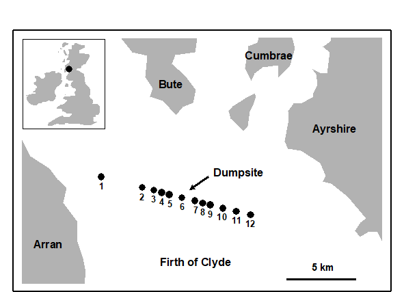
Fig. 8.3. Garroch Head macrofauna {G}. Map showing location of dump-ground and position of sampling stations (1–12); the dump centre is at station 6.
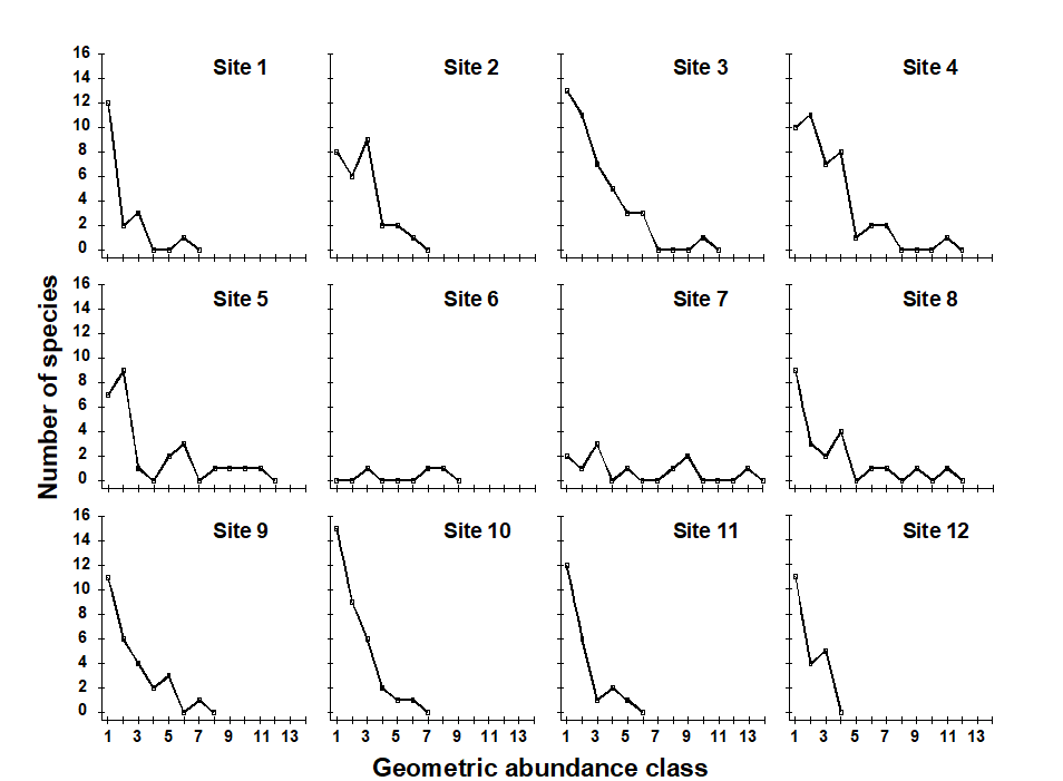
Fig. 8.4. Garroch Head macrofauna {G}. Plots of $\times 2$ geometric species abundance classes for the 12 sampling stations shown in Fig. 8.3.
In Fig. 8.5a, average ranked species abundance curves (with the x-axis logged) are given for the macrobenthos at a group of 6 sampling stations within 250m of the current centre of oil-drilling activity at the Ekofisk field in the North Sea {E}, compared with a group of 10 stations between 250m and 1km from the centre (see inset map in Fig. 10.6a for locations of these stations). Note that the curve for the more polluted (inner) stations is J-shaped, showing high dominance of abundant species, whereas the curve for the less polluted (outer) stations is much flatter, with low dominance. Fig. 8.5b shows k-dominance curves for the same data. Here the curve for the inner stations is elevated, indicating lower diversity than at the 250m–1km stations.

Fig. 8.5. Ekofisk macrobenthos {E}. a) Average ranked species abundance curves (x-axis logged) for 6 stations within 250m of the centre of drilling activity (dotted line) and 10 stations between 250m and 1km from the centre (solid line); b) k-dominance curves for the same groups of stations.
Abundance/biomass comparison plots
Whether k-dominance curves are plotted from the species abundance distribution or from species biomass values, the y-axis is always scaled in the same range (0 to 100). This facilitates the Abundance/Biomass Comparison (ABC) method of determining levels of disturbance (pollution-induced or otherwise) on community structure. The initial paradigm was for soft-sediment macrobenthos . Under stable conditions of infrequent disturbance the competitive dominants in benthic communities are K-selected (conservative) species, with the attributes of large body size and long life-span: these are rarely dominant numerically but are generally dominant in terms of biomass. Also present in these communities are smaller r-selected (opportunistic) species with a smaller body size and short life-span, which can be numerically significant but do not represent a large proportion of the community biomass. When pollution perturbs a community, conservative species are less favoured in comparison with opportunists. Thus, under pollution stress, the distribution of numbers of individuals among species behaves differently from the distribution of biomass among species.
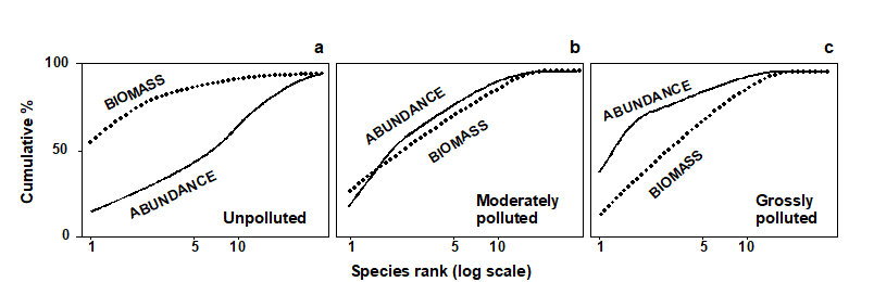
Fig. 8.6. Hypothetical k-dominance curves for species biomass and abundance, showing ‘unpolluted’, ‘moderately polluted’ and ‘grossly polluted’ conditions.
The ABC method, as originally described by Warwick (1986) , involves the plotting of separate k-dominance curves ( Lambshead, Platt & Shaw (1983) ) for species abundances and species biomass on the same graph and making a comparison of the forms of these curves. The species are ranked in order of importance in terms of abundance or biomass on the x-axis (logarithmic scale) with percentage dominance on the y-axis (cumulative scale¶). In undisturbed communities the biomass is dominated by one or a few large species, leading to an elevated biomass curve. Each of these species, however, is represented by rather few individuals so they do not dominate the abundance curve, which shows a typical diverse, equitable distribution. Thus, the k-dominance curve for biomass lies above the curve for abundance for its entire length (Fig. 8.6a). Under moderate pollution (or disturbance), the large competitive dominants are eliminated and the inequality in size between the numerical and biomass dominants is reduced so that the biomass and abundance curves are closely coincident and may cross each other one or more times (Fig. 8.6b). As pollution becomes more severe, benthic communities become increasingly dominated by one or a few opportunistic species which whilst they dominate the numbers do not dominate the biomass, because they are very small-bodied. Hence, the abundance curve lies above the biomass curve throughout its length (Fig. 8.6c).
The contention is that these three conditions (termed unpolluted, moderately polluted and grossly polluted) should be recognisable in a community without reference to control samples in time or space, the two curves acting as an ‘internal control’ against each other. Reference to spatial or temporal control samples is, however, still desirable. Adequate replication of sampling is a prerequisite of the method, since the large biomass dominants are often represented by few individuals, which will be liable to a higher sampling error than the numerical dominants.
Whilst described in terms of benthic macrofauna the paradigm is likely to apply much more generally†.
¶ The species are therefore in a different order on the x axis for the abundance and biomass curves – the species identities are not matched up in any way, it is simply the dominance structure of the community that is separately captured for abundance and biomass.
† Indeed, the several hundred papers that cite Warwick (1986) include many examples of application to other marine fauna (e.g. fish communities, where over-fishing tends to be accompanied by reduction in average body-size and replacement of large-bodied by increased abundance of smaller-bodied species) and terrestrial/freshwater fauna: birds, dragonflies, small mammals, herpetofauna (whose ABC curves tracked successional recovery after forest fires, Smith & Rissler (2010) ) etc.