7.7 Example: Ekofisk oil-field macrofauna
The 39 sites sampled for benthic infauna at different distances from an oil-field in the N Sea were shown in the last chapter to demonstrate a clear gradient of community change with distance (nMDS, Fig. 16.3). The shade plot of Fig. 7.10a however, which orders the sites in increasing distance from the rig, and puts the species (reduced to 74 of the original 173 species) in alphabetic order, does not present a clear picture at all. Apart from Chaetozone setosa, the most dominant species in terms of abundance (an opportunist polychaete which appears to thrive at the impacted sites close to the oilrig), the immediate visual impression is not of a striking gradient potentially caused by the dispersal of THCs and other contaminants from the oilfield. Yet the non-metric MDS does indeed display such a clear and striking gradient (Fig. 7.11), and the explanation is not the C. setosa counts because if that species is removed, the MDS remains unchanged (the two sample resemblance matrices, with and without C. setosa, are rank-correlated at the level of 0.993).
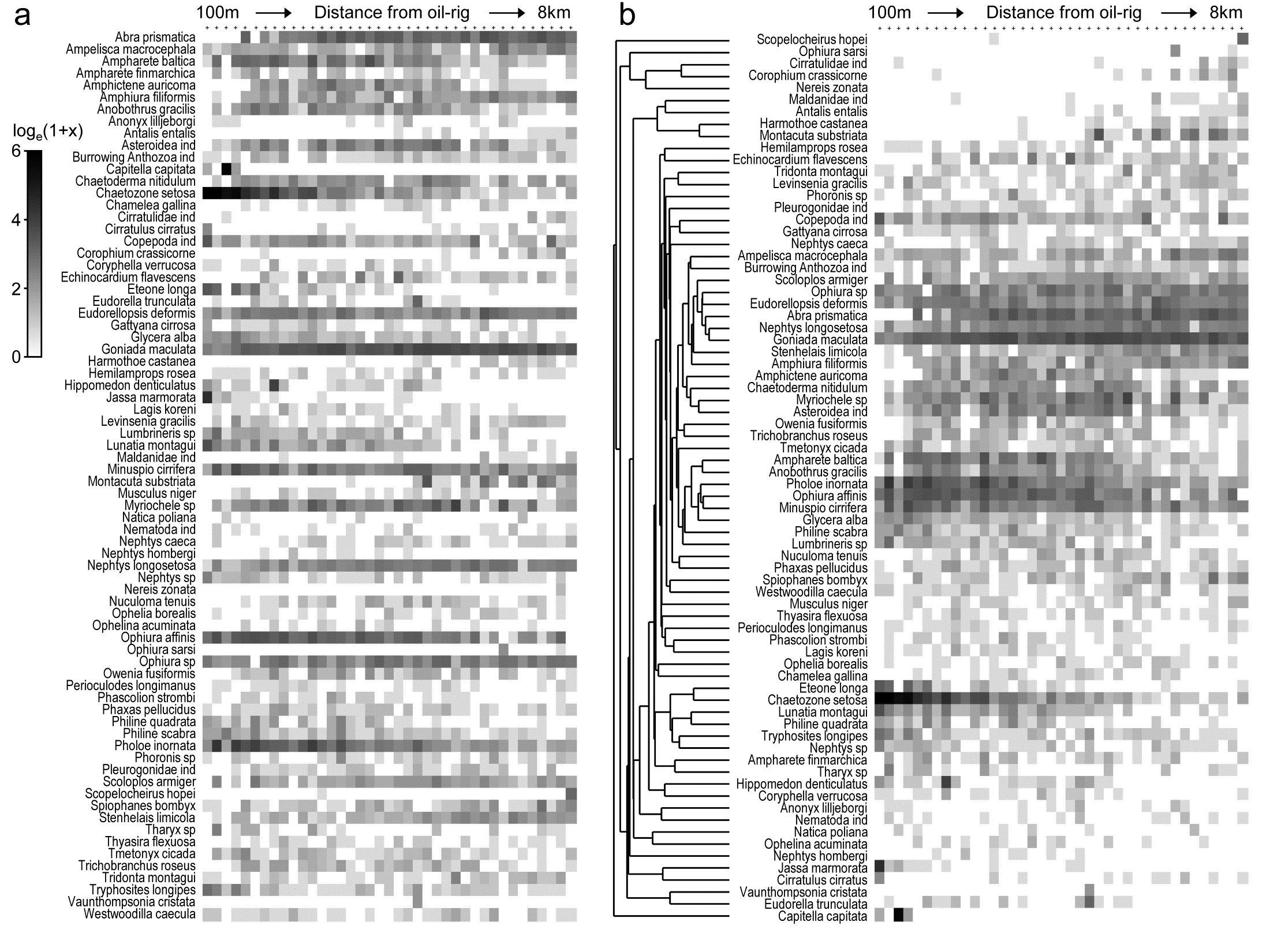
Fig. 7.10. Ekofisk oil-field macrofauna {E}. a) Shade plot of the data matrix of 39 sites (columns), ordered by increasing distance from the oil-rig, and a subset of 74 of the 173 species (rows), those accounting for at least 1% of the total count in at least one of the sites. Depth of grey shading is linearly proportional to a log$_e (x+1)$ transformation of the counts x (see key). Species are in arbitrary (alphabetic) order.
b) Shading is exactly as for (a) but the species are re-arranged, firstly hierarchically grouped by an agglomerative clustering (shown) of untransformed but species-standardised values, using the index of association to define species similarity, then re-ordered (within the constraints of permitted dendrogram rotation) to maximise the seriation $\rho$ statistic (Spearman rank) among species.
Why is MDS picking up such a pattern? The human eye can see it in a clear fashion only if the species are grouped by dendrogram and reordered serially within those constraints, to obtain the shade plot Fig. 7.10b.
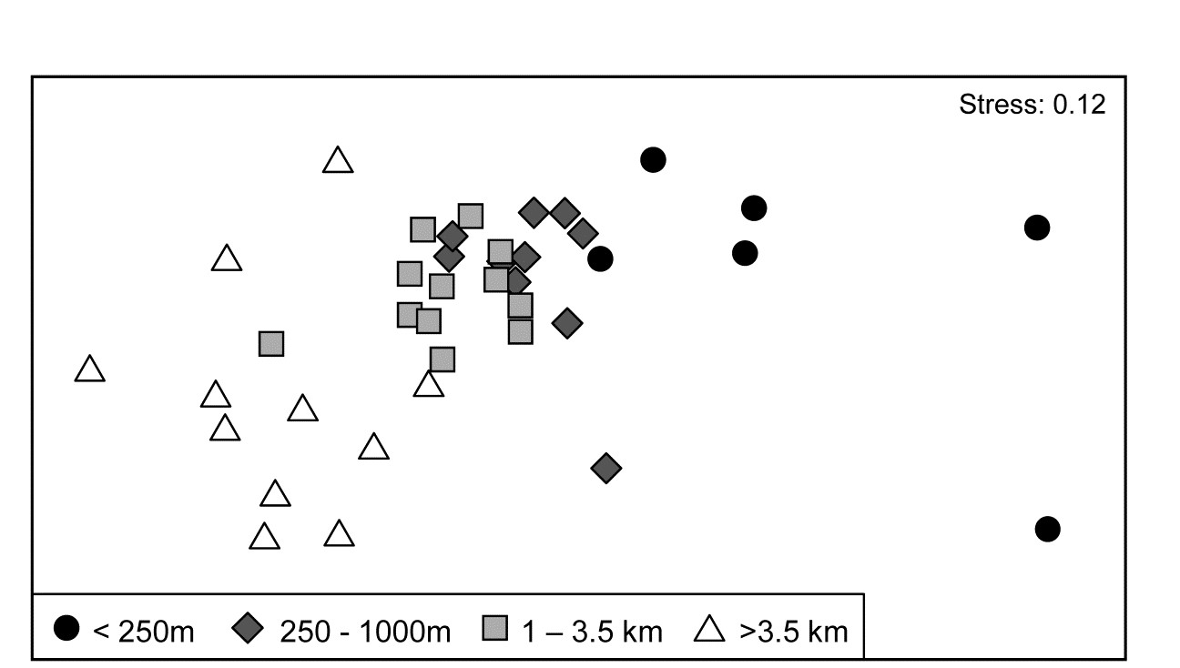
Fig. 7.11. Ekofisk oil-field macrofauna {E}. nMDS ordination of 39 sites from four (pre-assigned) groups of distances from the oil-field, based on the 74 species and log$_e(x+1)$ transformed counts displayed in the shade plots of Fig. 7.10, and utilising Bray-Curtis similarities. (Note the closely similar outcome to the previous ordination of these data, Fig. 6.13a, based on the full set of 173 species and square-root transformed counts). The plot shows a clear change in community structure with distance from the rig, extending to a distinction between sites within and outside 3.5km, even though the latter are in all directions away from the rig and therefore distant from each other.
7.10b contains identical information to 7.10a but now the pattern is obvious! As pointed out earlier, when the sample axis is fixed, independently of the species data (here it is simply a distance scale), any visual suggestion of diagonalisation is prima facie evidence for a community gradient across that sample ordering, and here it is abundantly clear (and ordered ANOSIM or RELATE tests absolutely confirm it). Species near the bottom of the shade plot (7.10b) tend to be those which, like C. setosa, increase sharply in abundance closer to the rig; those which are found throughout the distance range but still tend to increase towards the rig are seen in the mid-plot; above them is a group of species with a non-monotonic response, having their larger values in the mid-distances; then come a further set of abundant species which tend to decline nearer the rig, and at the top, the species which only tend to be found in the ‘background’ communities at >3-4km distant. Scattered throughout are species that show little relation to distance but these tend to be only patchily present, and there is a dominant ‘feel’ of groups of species responding (or least correlating) in different ways to the conditions represented by the distance gradient. The real strength of a multivariate approach is thus seen to be the way it is able to stitch together a little information from a lot of species, not only to produce a striking synthesis such as the MDS of Fig. 7.11 but also formal tests for this relationship. Having seen Fig. 7.10b, it is easier to look at the same information in the unordered 7.10a and note the same individual species patterns. To a multivariate analysis the two plots are naturally identical (sample similarity calculation makes no use of ordering of the species), but to a merely human interpreter, there can be little doubt which of these plots is the more useful!
Immensely helpful though shade plots can be, there is one important way in which they do not fully present the information captured by a multivariate analysis. The pre-treatment steps, such as transformation, are visually well-represented, and a quick glance at the plot is enough to get a good feel of how many, and which, species will contribute to the analysis (a great many for the log-transformed Ekofisk data). But what is not represented is the effect of the specific resemblance measure in synthesising this high-d information. For example, for the Ekofisk analysis, which species primarily account for the dissimilarity between the 1-3.5km distant sites and those beyond 3.5km, seen in the MDS plot of Fig. 7.11? It is clear from the shade plot that there will be many, but it is still instructive to have a list of those species in decreasing relative contribution to the total dissimilarity between those two groups, and this is provided by the similarity percentages routine (SIMPER).