Coherence plots wizard & Types 2/3 SIMPROF; (L. Linnhe macrofauna)
The third item on the Wizards menu is Coherence plots. This is a combination of SIMPROF runs within a species CLUSTER analysis, to identify groups of coherent species, and Plots>Line Plot, to draw line graphs of species-standardised matrix entries (y) across samples (x), separately for each coherent species group. The output plots are therefore simple and transparent, describing patterns of response of each species across the sample ordering in the original matrix (e.g. through time, space or over an environmental gradient). The species abundance – or other quantity measure – is expressed in relative terms, as a percentage of total abundance for that species over all samples. The novelty here is that these line plots are grouped together in species sets which are statistically indistinguishable internally but significantly different over sets, using a series of SIMPROF tests, referred to as Type 3 SIMPROF. These are the precise analogue of similarity profile tests within sample cluster analyses that we saw applied in Section 6, to create significantly different sample groups (Type 1 SIMPROF) – and indeed one could trick earlier versions of PRIMER into carrying out Type 3 SIMPROF tests by defining species as samples and samples as species. This is now unnecessary (and was always rather confusing!) since PRIMER 7 automatically computes the right form of SIMPROF tests (1 or 3) in association with sample or species clustering. A single Type 2 SIMPROF test is also now offered in the Analyse>SIMPROF routine, which applies to species similarities (as with Type 3), but tests a different null hypothesis, namely that a set of species has no associations among any of its species (through competitive interaction or synergy, or more likely through opposite or common responses to differing abiotic conditions). In comparison, the null hypothesis for Type 3 SIMPROF tests is that the subset of species currently under test have a set of common (coherent) pairwise associations with each other. The technical distinction between the types is a combination of whether they calculate sample similarities (Types 1 and 4) or species associations (Types 2 and 3), and whether the tests work by randomly and independently permuting species over samples (Types 1 and 2) or permuting samples over species (Types 3 and 4). The Type 4 combination – testing sample similarity profiles by permuting samples over species is offered by Analyse>SIMPROF for completeness but would appear unlikely to have meaningful application. Some details on Type 2 and 3 SIMPROF tests on species are given in Chapter 7 of CiMC, e.g. the schematic diagram of Fig. 7.2, but the definitive paper on this, which also gives detailed discussion of several applications, is Somerfield PJ & Clarke KR 2013 J Exp Mar Biol Ecol 449: 261-273.
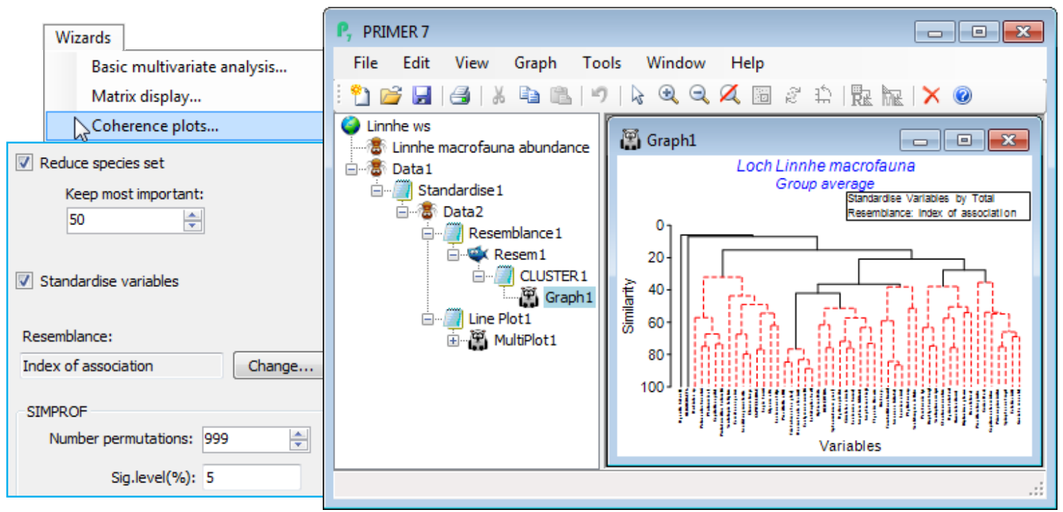
Soft sediment macrofaunal abundance at a single site in Loch Linnhe, Scotland was studied over 1963-73 by Pearson TH 1975, J Exp Mar Biol Ecol 20:1-41 (it is seen again, along with matching biomass data, in the species diversity curves of Section 16). The (pooled) data Linnhe macrofauna abundance, in C:\ Examples v7\Linnhe macrofauna, is of 11 samples (years) containing a total of 111 species. In 1966, pulp-mill effluent started to be discharged in the vicinity of the site, with the rate increasing in 1970 and reducing in 1972. On Linnhe macrofauna abundance, run Wizards> Coherence plots, taking the default settings shown below (50 species retains all those accounting for ~1% or more of the total abundance in at least one year, as seen from Select>Variables). The wizard first creates the selection in Data1, standardises the species, Data2, computes the index of association among species, Resem1, clusters this with Type 3 SIMPROF tests (creating group indicator SFGv1) and runs the line plots for those groups, held as separate graphs in MultiPlot1.
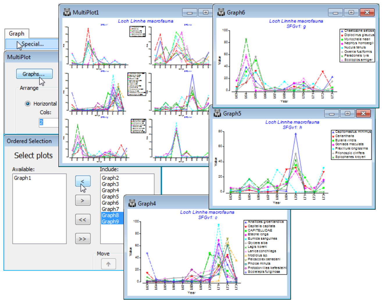
The ‘thumbnail’ multi-plot is seen to contain 8 groups of line plots, of varying numbers of species in each, with two of the SIMPROF groups consisting only of single species which have a presence in only one of the 11 years (a different year). If you wish to remove these from the multiplot, as below, take Graph(/right-click)>Special>Graphs and send Graph8 and Graph9 to the Available rather than Include box. Also use this menu to change the layout to, for example, 3 rows by 2 cols, by (•Horizontal>Cols: 2). Clicking on an individual plot within the multi-plot unfurls the full set in the Explorer tree, and each plot identifies in its subtitle the letter (a, b, c, …) giving the level for that group in the indicator SFGv1. From the reduced set in Data1, the entries for just that group of species could be examined by selecting them with Select>Variables>(•Indicator levels)>(Indicator name: SFGv1)>Levels. Note that in Data1 this would be the original abundances – the standardised values used in the plot could be selected in the same way from Data2. [And if selection was needed from the original Linnhe macrofauna abundance sheet, you would first have to Edit>Indicators>Import>(Worksheet: Data1)>Select>(Include: SFGv1) from that original data matrix to import the SIMPROF groups, since the reduced matrix selection in Data1 is on a new branch of the Explorer tree and any factors and indicators are never automatically propagated between different branches].
The 6 major coherent species sets identified by the SIMPROF tests span a range of responses to the effects of the pulp-mill effluent from groups of species whose abundances: (g) are largely confined, in relative terms, to the earliest, pre-impact, years; (f) peak at the earliest stages of impact but then decline; (d) have a similar pattern but not kicking in until a year or so later; (h) show the same peak and decline but much further into the impact sequence; (e) stay relatively abundant until the most impacted years of 1970-72; and (c) are mainly the real opportunists (such as the Capitellids) that thrive in the most impacted years but decline sharply under the ameliorated conditions of 1973 – a year in which some of the other groups show signs of bouncing back. [Note that the graphs could have been arranged in the order described here, within MultiPlot1, again by Special>Graphs but now using the Move arrows on the Include list. You may find it helpful to rename the individual graphs Graph2, …, Graph7 with their SIMPROF levels, respectively f, e, c, h, g, d, but note that you will then have a blank multi-plot since it can no longer find the original names(!) – this is fixed easily by Special>Graphs, highlighting f to d and moving them across together to the Include list].


