Matching when there are selections
An attempt to run the routine with the matrices reversed, or to run it on a data type Environmental sheet, will provoke one or more warnings (e.g. Primary data not Abundance), though not usually an outright error. It is always advisable to check that Data types have been correctly defined, and change them if necessary with Edit>Properties – you will then get the benefit of sensible defaults and warnings if you make an unexpected choice. As with all routines using a secondary sheet, there is strict matching of sample labels in combining the sheets, but with the option to relax this and take samples in the worksheet orders, if the two matrices are of the same size. If they are not, and all the abundance sample labels can be found in the biomass sheet, then plots will be performed for all the samples with abundance data. (Thus, if the selection of years 1996 and 1971 in the previous illustration had not been rescinded, the routine would return ABC plots only for those two years). This is in line with the general principle throughout v7 – the active sheet determines which samples are analysed, the secondary sheet is a look-up table (but it is advisable in this context to make sure everything matches!). The species labels do need to match because a careful check is made that there are, for example, no species which have a positive biomass but zero abundance (the converse is permitted, since there may be species which are present but too small-bodied to have measurable weight). After those checks are completed satisfactorily however, the dominance curves re-order the species differently (in decreasing rank order) for each sample and for biomass and abundance – it is inherent to the method that the species are not in the same rank order for the B and A curves.
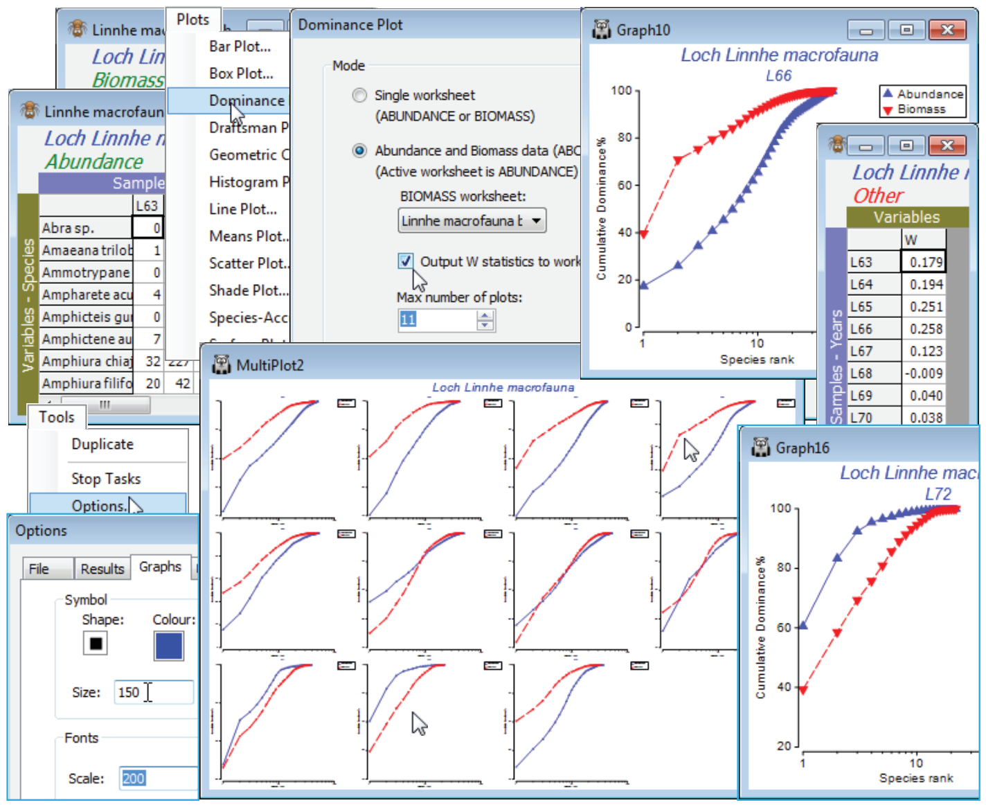
So, on the abundances, take Plots>Dominance Plot>(Mode•Abundance and Biomass data, ABC)> (Biomass worksheet: Linnhe macrofauna biomass) & (Output W statistics to worksheet) & (Max number of plots: 11) & (Plot type•Cumulative). In addition to the multi-plot of 11 ABC plots there will be a column of W statistics for each sample. W measures the extent to which the biomass curve lies above the abundance curve (positive for undisturbed, negative for impacted samples, in theory) and is a convenient single index to report, if presenting large numbers of ABC plots is impossible. Note also in the below that the font and symbol sizes in the single plots (obtained by clicking on that component in the multi-plot) are enlarged. This is much more conveniently done in a single operation, prior to running Dominance Plot, by changing defaults with Tools>Options>Graphs. These new defaults are in action for all plots (until changed), even after exit from PRIMER.
The W sheet can then be Tools>Merge(d) with other classic or distinctness-based diversity indices for univariate plotting, testing etc. Sometimes the juxtaposition of abundance and biomass data in W does capture a different diversity dimension than the classic axis of richness-evenness seen for the multivariate analysis of diversity measures in the previous section. The ABC plots in this case follow the pattern, seen in other diversity indices also, of initial stability (with the biomass curve over abundance), then a gradual switch over of the curves in the period of effluent impacts from 1966, increasing in 1970 (abundance clearly over biomass in 1972), with apparent recovery in 1973 after the discharges decreased in 1972. Close the Linnhe workspace; it will not be needed again.

