Threshold metric MDS (tmMDS)
The mMDS Shepard diagram above strongly suggests a middle course between simple metric and non-metric MDS, which we shall term threshold metric MDS (tmMDS), in which the Shepard plot is fitted by a straight line but not through the origin. It will almost always (as here) intersect the x axis of the Shepard plot, i.e. dissimilarities below that threshold are expected to be represented by zero distances – coincident points in the configuration. This intersection with the x axis is therefore an interesting parameter, essentially reflecting sampling error – the dissimilarity among replicate samples from the same condition (same site, time etc). For many data sets, metric MDS is unable adequately to represent both the genuine structure in the samples and the sampling variability amongst replicates in a low-d plot, without distorting linearity of the dissimilarity scale interpreted directly as distances. nMDS solves this by compressing the lower dissimilarities (often replicate error) into a much smaller range of near-zero distances, so that there is ‘room’ in 2-d to display the real structure among groups and along gradients etc. tmMDS solves it more crudely by attempting to truncate all dissimilarities below a fitted threshold to zero, subtracting the sampling error (which is represented by this threshold) from the larger dissimilarities. The advantage of tmMDS is that the ordinations will still have meaningful axis scales, in terms of the original dissimilarities – though it should be remembered that the threshold dissimilarity on the Shepard plot needs to be added back to any distances ‘read off’ from the ordination scales in order to produce a dissimilarity.
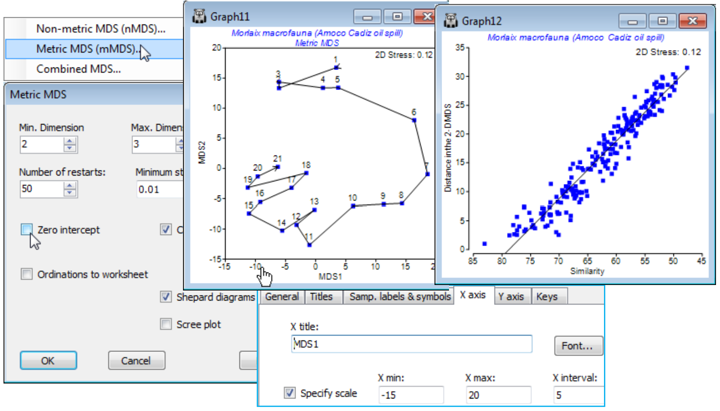
Run tmMDS on Resem1, by selecting Metric MDS (mMDS) and unchecking (✓Zero intercept). Refine the axis scales of the tmMDS plot from the X axis tab (reached from e.g. Graph>General).
Note how variability around the line in the Shepard plot tightens up even further, now a reasonable model is fitted, and the tmMDS is virtually indistinguishable from the nMDS, seen much earlier in this section (and Fig. 5.8 in CiMC). The 2-d nMDS stress (see earlier Shepard plot or Fig. 5.9) is slightly lower at 0.09 rather than 0.12, a typical difference between a non-metric and metric stress in cases where both fit well (the relationship is genuinely linear). Given the low stress, the scales on the tmMDS can be used to give a ‘feel’ for the actual dissimilarity between different states of this community (rotating the plot may help to read off specific distances). The largest community difference between a sample prior to the spill and one in any subsequent year is about 30 units and the Shepard diagram shows the fitted threshold to be 21% dissimilarity (79% on the x axis scale of similarity). Adding these gives a dissimilarity of about 51%, and examination of the resemblance matrix shows the similarity between times 1 (April ’77) and 11 (July ’79) to be just under 52%. While tmMDS works well in this case it will not always be an appropriate ordination method, of course – any situation in which there is large scale turnover of species across the set of samples will tend to have a Shepard diagram which is strongly curvilinear at the large dissimilarity end of the scale, especially as it approaches 100%, and the ability of nMDS to model that relationship is crucial to an interpretable low-d display: small dissimilarities are compressed, large ones expanded.
Re-save the current workspace as Morlaix ws and close it.

