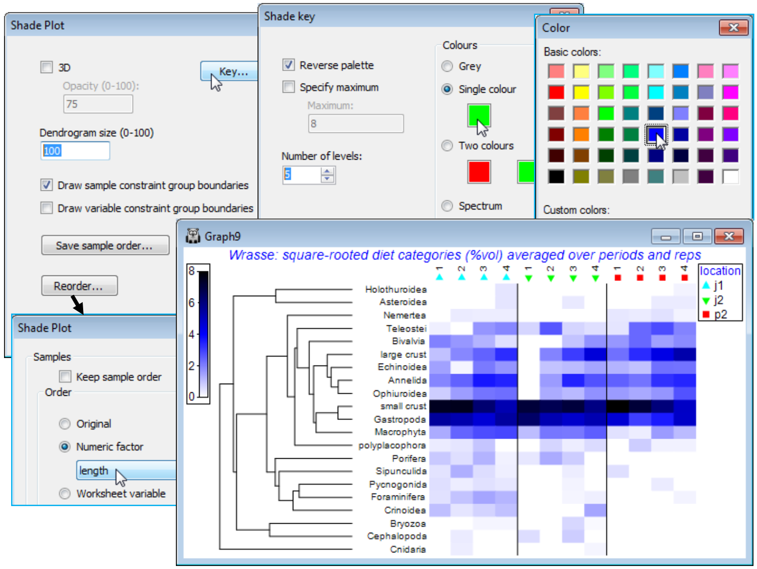
Special menu for shade plot; Shade plot colours
With OK to get back to the first dialog screen under Special, we now look at the options available there. (Dendrogram size 100) will increase the size of the variables dendrogram (and a samples dendrogram at the same time, if one has been selected) so that its structure can be better seen – whether this is beneficial depends on how large a block of matrix entries needs to be squeezed into a sensible display area, but it is very useful if you want to manually rotate the dendrogram(s). The Key button leads to the Shade key dialog, which can also be accessed directly by clicking on the scale bar to the extreme left of the shade plot. This allows adjustment of the scale representing depth of shading, the specified maximum always corresponding to jet black shading(/colouring). It could be argued here that it might be useful to reserve this for the potential upper limit of the %vol scale rather than the default of a (rounded up) observed maximum. So, take (✓Specify maximum> Maximum: 10), since on the square-root scale used, this would back transform to represent 100% of average gut content being from one dietary category only. Also add some intermediate scale levels with (Number of levels: 6). The (✓Reverse palette) box would rarely be changed since this produces a shade plot in which black represents absence and white the specified maximum value. Black seems a less natural way of viewing absence in a community matrix, though it is the natural choice in a heat map, running from extreme cold to white hot. [Reference to this palette as reversed by default really comes from the fact that RGB scales have 0 values for all three colours for black, up to their maximum (255) for all three, producing white]. Other colours than grey for a shade plot are possible and the below shows a single colour choice, switched from the default of green to blue.
You should experiment with the colour options, though there is not unlimited flexibility here in constructing a scale. A shade plot should ideally show a progression of colour which allows a natural feel for which are the larger and which the smaller entries in the matrix. For the (Colours• Two colours) option, the square to the left should be for the higher values (it will merge into black) and to the right for the lower abundances (it will appear from the white space absences). There is also a fixed colour spectrum choice (below). The other change made above was that the font for both the colour scale and symbol key benefitted from a small increase (both are of few characters). You can change Key font properties (as for any plot) by the Keys tab accessed from the usual Samp. Labels & Symbols or General dialog. For the above, this used Keys font>(Size: 120).
The corresponding nMDS ordination to the above shade plot is shown below – note the capacity a multivariate approach has to pick out the borderline significant (p<1.5%) location differences, from what the shade plot again shows to be rather subtle changes. The more striking (and highly significant) dietary progression with increasing wrasse sizes, running roughly in parallel for the three locations in the nMDS, is also evident on the shade plot. It is seen in the increasing consumption of a range of dietary categories (e.g. large crustaceans, annelids, ophiuroids, teleosts) and a decline in the dominant category of small crustaceans. An effective presentation is then a bubble plot on the MDS, thus linking individual prey categories to the pattern for the dietary assemblage as a whole, and the ordination is shown below as a multiple bubble plot (Section 8). But the selection of dietary categories to display in this way (the ordered ANOSIM test having shown beyond doubt that there are such dietary differences to interpret) is greatly aided by careful study of the shade plot – which, importantly, does represent the matrix entries in the form they enter the similarity calculations.

