(L. Linnhe macrofauna time-series); k-dominance, ordinary & partial plots
Macrobenthos in soft sediments of a site in Loch Linnhe, Scotland were monitored by Pearson TH 1975, J Exp Mar Biol Ecol 20:1-41, over the period 1963-73, recording both species abundance and biomass. The data are pooled to a single sample for each year, with an assemblage of 111 species. Starting in 1966, pulp-mill effluent was discharged in the vicinity of the site, increasing in 1970 and reducing in 1972. Abundances are in Linnhe macrofauna abundance, and the matching total biomass, of each species for each of 11 years, in Linnhe macrofauna biomass, in C:\Examples v7\ Linnhe macrofauna. Though Linnhe ws was created in Section 10, you may prefer a new start here.
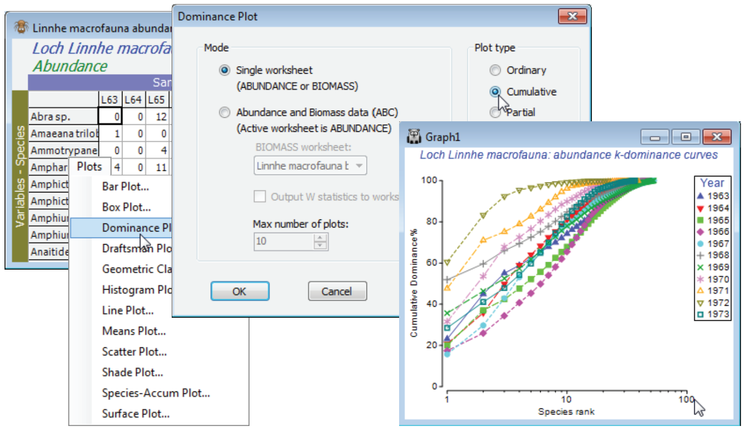
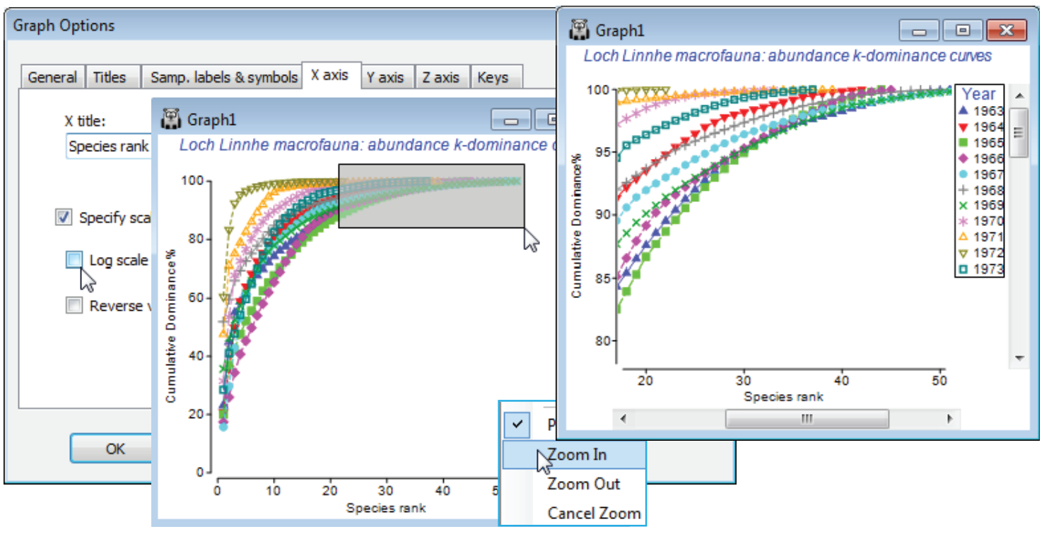
On the abundance matrix take Plots>Dominance Plot>(Mode•Single worksheet) & (Plot type• Cumulative). This produces a single plot of the k-dominance curves for all 11 years, the earlier years being seen to have higher evenness (lower dominance), by their placement lower down the y axis, and higher species richness by their extent along the x axis, before the full 100% is reached. In contrast, the years of highest effluent release are characterised by low evenness (curves move up the plot) and lower richness. The latter tends to be under-emphasised on k-dominance curves since the default is to plot species ranks on a log scale. This can be removed by unchecking (✓Log scale) on the X axis tab of Graph Options, best accessed simply by clicking the x axis scale, but typically that would underemphasise the equitability component, so a log scale is usually preferred. Note that most of the usual plot features, such as a rectangular zoom (changing the aspect ratio) are available.
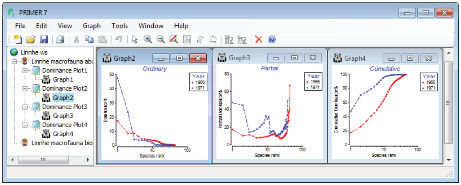
To note the effect of switching from cumulative to ordinary/partial dominance curves, first select just the years 1966 (the last year before effluent discharges began) and 1971 (one of the two peak years of discharge), by highlighting those columns in the data and Select>Highlighted. Perform three separate runs of Plots>Dominance Plot, with Plot type options of •Ordinary, •Cumulative and •Partial, then close all windows except the three graphs and Window>Tile Vertical to obtain the displayed desktop. Note how the cumulative plot emphasises the greater dominance of the two most abundant species in 1971 (once high % values are reached they cannot decrease!), but the partial plot also picks out an unevenness for that year in the dominance structure of species lower in the rank order, an undisturbed partial dominance curve typically looking more like that for 1966.


