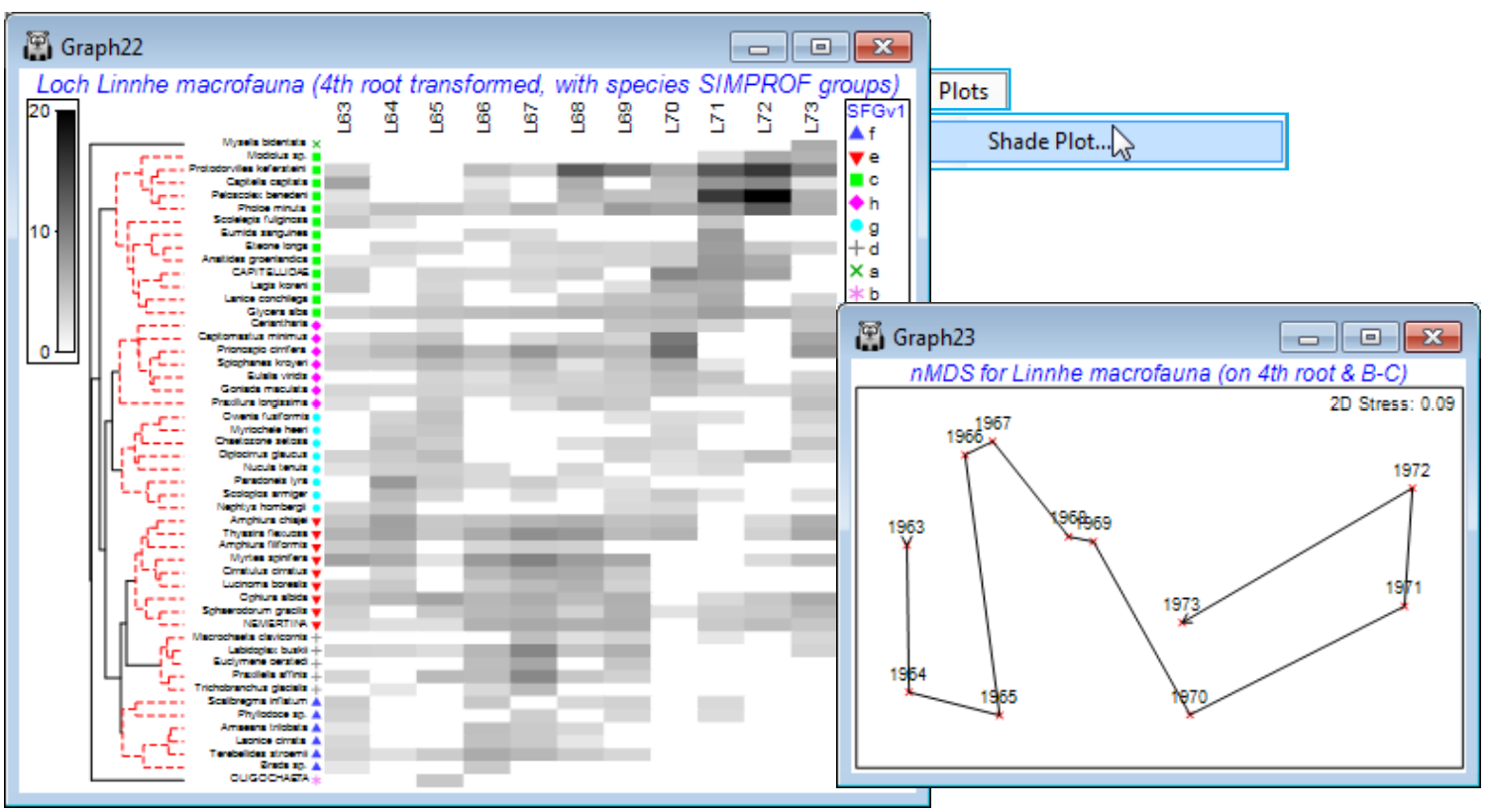
Line plots vs Shade plots
For this (reduced) Loch Linnhe data matrix, e.g. with the selection of 50 species made in Data1, it is straightforward to create also a shade plot. There are, of course, differences in visual impact in the way matrix entries are represented by y axes of a line plot or depth of shading but there are also some contrasts in the emphases that PRIMER gives to the two displays:
a) both would usually require a reduced number of species to be analysed and use the same species resemblance measure (index of association) and species clusters. The automatic Wizards>Matrix display does not, however, carry out the Type 3 SIMPROF tests of the** Coherence plots** routine – though a direct run of Shade Plot could certainly display the groups resulting from these tests;
b) Wizards>Coherence plots generates line plots based on the standardised species values, usually without transformation, so that the emphasis is on which species follow the same patterns, or have statistically different responses over samples. In contrast, Wizards>Matrix display would usually show the transformed (and not species standardised) values by depth of shading/colouring, since its primary emphasis is on how the species contribute to the multivariate analyses of the samples. It is perfectly possible, however, using a (non-wizard) run of Shade Plot to create a display of the same standardised (non-transformed) values as are used in Coherence plots – see below;
c) Matrix display and the direct Shade Plot routine will terminate with an error if a worksheet of type Environmental is submitted to them – they will only accept data of types Abundance, Biomass or Other. This is because a shade plot is designed to display quantities, with blank (white) space for absence through to black for the (rounded up) largest quantity in the matrix, with the same scale applying to all variables (usually taxa). The measurement units for environmental variables usually differ (or at least the ranges occupied within a common scale differ strongly) and normal¬isation is required to produce a common scale – zero now has no particular meaning. One could force the software into producing a shade plot for such environmental data – change the data type with Edit>Properties>(Data type•Abundance) then add a constant (k) to move the scale to positive values, with Pre-treatment>Transform (individual)>(Expression: V+k) – but the PRIMER shade plots are visually set up to suit only quantity data. In contrast, the Coherence plots and multiple Line Plot routines work well for all data types, though again for variables converted to a common scale, such as standardising for taxa and normalising for abiotic data – the latter is also seen below.
For the selected 50 species from the Linnhe data (Data1), run Pre-treatment>Transform(overall)>(Transformation: Fourth root) and Plots>Shade Plot. Note that the plot (which is not wonder¬fully clear!) has the years already in the right order, since that was the sample order in the matrix, but the species need grouping according to the dendrogram given by the run of Coherence plots, Graph1, with Graph>Special>Reorder>Samples>(Order•Original) & (Constraint•None) and Variables> (Order•Seriate>Variable resemblance Resem1) & (Constraint•Variable dendrogram Graph1) and (No. of seriate restarts: 999). The species SIMPROF groups are seen in red on the dendrogram but can be accentuated by Graph>Var. Labels & Symbols>(Symbols✓Plot>✓By indicator SFGv1). This is now a plot of the dominant ~50% of the species contributing to an nMDS based on the 4th-root transform of the original Linnhe macrofauna abundance matrix under Bray-Curtis similarity.

