Segmented bubble plots
Given the inadequacies of vector plots for displaying species contributions to ordinations, but the practical need to reduce the number of graphs which can be displayed in publications, PRIMER 7 introduces a segmented bubble plot, which attempts simultaneously to display the bubble sizes for several species (or abiotic variables) on the same ordination plot, technically as circle sectors (or their spherical equivalent in 3-d), with a species always occupying the same sector position but at differing sizes. Careful choice is needed of variables to juxtapose, their colours and positions, and whether common or individual scaling is used, but some of the same flexibility is available as for single-variable bubble plots (options not offered here include user-supplied images and the ability to represent different factor levels by different colours – that would be too confusing by far!)
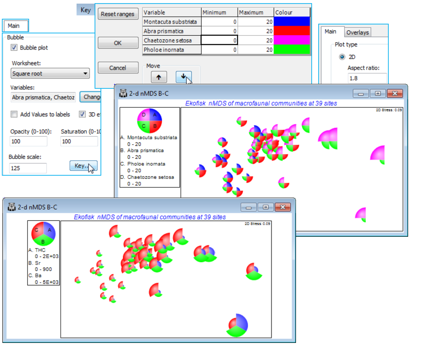
Returning to the display of individual species counts (square-rooted) on the Ekofisk 2-d nMDS B-C ordination, the four separate bubble plots seen earlier can be combined into a single plot by taking Graph>Special>Main>Bubble plot>(Worksheet: Square root)>Change and moving Chaetozone setosa, Montacuta substriata and Pholoe inornata to join Abra prismatica in the Include box. Key now lists all four species in the Key dialog, with their differing default ranges (e.g. 0 to 7 for Abra prismatica but 0 to 30 for Chaetozone setosa). As before, these need to be harmonised (e.g. set to 0 to 20) so that the relative contributions each of these species is likely to make to defining parts of the community gradient can be properly assessed. Also change the colours to match those for each species used on the single plots (three pages ago) and, since there is a natural progression of species (not alphabetic!) in terms of where on the gradient they are mainly found, use the Move up and down arrows to place them in the order: M. substriata, A. prismatica, P. inornata and C. setosa, which then become the sectors (quadrants in this case) reading clockwise from top right. Again, depending on how many points there are on the ordination (and this one is possibly too cluttered for a really effective segmented bubble plot) you might need to adjust the overall size of bubble plotted for the specified maximum count (square-rooted) of 20. The plot below uses (Bubble scale: 125) and, of course, the bubble size in the key will correctly reflect such a change. Another minor detail is that, for this rather long thin ordination plot, the shape of the boundary has been changed to match that, with Main>Plot type•2D>(Aspect ratio: 1.8) rather than the default of 1.5.
A segmented bubble plot for some of the abiotic variables (THC, Ba, Sr), on this same ordination, is obtained in the same way, substituting (Worksheet: Ekofisk environmental) for Square root, the only change being that default ranges for each variable are used, since measurement scales differ. (Re-)save the Ekofisk workspace as Ekofisk ws, and close it.
Segmented bubble plots work best either where species values change markedly over the points of the ordination, or there are relatively few points, such as in an ordination means plot. Examples of both these situations are found at the end of Chapter 7 of CiMC, on data sets that we have already met, so you may like to reproduce them, as below.

