Draftsman plots recap & transform choices
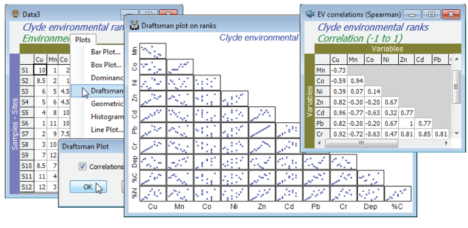
Normalisation (subtracting the mean and dividing by the standard deviation, for each variable), and subsequent selection of Euclidean distance or PCA, operates more effectively the closer the data is to approximate (multivariate) normality. The latter is not a prerequisite of PCA but it is the genesis of the method and it is certainly true that, if the data is strongly skewed, the outliers will dominate the PC axes and will often lead to poor-quality interpretation. Transformations of specific variables, or groups of similar variables will often be desirable, by Pre-treatment>Transform(individual) – as in the previous section, and first met for environmental variables in Section 4. A useful aid to transformation choice is given by Plots>Histogram Plot or, where there are fewer samples, Plots> Draftsman Plot. The latter gives pairwise scatter plots between all (selected) variables. Two things are being looked out for here. Firstly, in the draftsman plot, are the samples roughly symmetrically distrib¬uted across the range of each variable? Or, if there is enough data to plot sensible histograms, are they very roughly bell-shaped, or at least symmetric rather than strongly skewed to one side? Secondly, if there are strong relationships between some pairs of variables, are these roughly linear rather than strongly curvilinear? This is also characteristic of (approximate) multivariate normality and an under¬pinning assumption of PCA, that ordinary product-moment correlations describe the dependence between variables (standard correlation measures only linear relationship). Examining these plots can therefore suggest possible transformations. If a distribution is right-skewed (bulk of the distribution to the left, with stragglers to the right) then a $\sqrt{y}$ (mild) or $\log y$ (strong) transform is called for. Use $\log(c+y)$ if $y$ can be zero or negative, choosing a constant $c$ to make all the $(c+y)$ values strictly positive before taking the log. If it is heavily skewed to the left, consider an inverse transform, $1/(c+y)$ where $c$ is close to zero, or a reverse transform, $\log (c–y)$ or$\sqrt{c–y}$ (strong or milder), where c is chosen to be larger than the maximum $y$. Try to use similar transforms for the same types of variables, and don’t be too pernickety! Logically, you need to use the same transform each time you analyse new data in the same context, and over-¬detailed choices will preclude that. The idea is only to avoid the worst effects of extreme outliers when working on original environmental scales that do not represent the true relationships between samples (those which organisms are responding to, for example – it is often the case that dose-response relationships for individuals to contaminants are more appropriate on log concentration scales). If you are still suffering agonies of indecision (!), then a purely automatic approach was given in the last section, namely to replace all variables by their ranks. This certainly achieves the twin aim of a symmetric distrib¬ution and linear relationships (see draftsman plot below) but it must lose a little sensitivity – organisms will be responding to the dose levels themselves, on some scale, not to their rank orders!
The workspace Clyde ws for the Clyde dumpground study should still be open. If not, open Clyde environment in directory C:\Examples v7\Clyde macrofauna, which has 11 environmental variables from the 12 sites (and was used extensively as an illustration in Section 11). Since there are so few samples, the draftsman plot is probably more effective here than histograms, but try both (Plots> Draftsman Plot and Histogram Plot), taking the usual graphics options to change symbol sizes, titles etc (right click then Samp. labels & symbols and Titles tab), and zooming in on part of the draftsman plot by drawing a box and Graph>Zoom In, or clicking the zoom icon on the tool bar. Most variables are seen to be right-skewed, which is why they were log transformed with Pre-treatment>Transform(individual) in the previous section (excepting water depth, a very different type of variable, which is seen to be more symmetric and not requiring transformation). Redraw the draftsman plot after you have made these transformations, this time creating the correlations among variables – more appropriate after transforming – with (✓Correlations to worksheet) in the dialog.
The scales are inevitably unreadable on the full draftsman plot, so the above takes the only graphic option which is specific to draftsman plots under the Graph>Special menu, to turn off (✓Show scales). Keeping scales, when they are readable (e.g. under zooming), does make the point however that even in a transformed state the variables take values over different ranges, and normalising will be required (after transformation) before running a PCA. The correlation matrix shows that many of these variables are highly inter-correlated. This is not a concern for the PCA ordination which follows: part of the point of a multivariate analysis is to represent high-d data in low-d space, and this will actually be more successful if many of these variables are inter-correlated, so the points effectively lie in a 2- or 3-d subspace of the 11-d space. (It is much more of a concern for linkage methods in Section 13, which try to ‘explain’ assemblage structure in terms of driving variables). The final possibility is to sidestep individual transformations altogether and work with the variable ranks (the Tools>Rank Variables routine covered in the previous section) – essentially this is just a different type of transformation. The variables are then forced to be symmetric, any (monotonic) relationships are certain to be linear, the variables are placed on a common measurement scale (the ranks 1 to 12 here) and there can, by definition, be no outliers – but the loss of the measurement scale is a significant drawback in using the PC axes for prediction. The correlation matrix is now of Spearman rank correlation (s) because this is ordinary Pearson correlation computed on ranks.


