Overlay trajectories
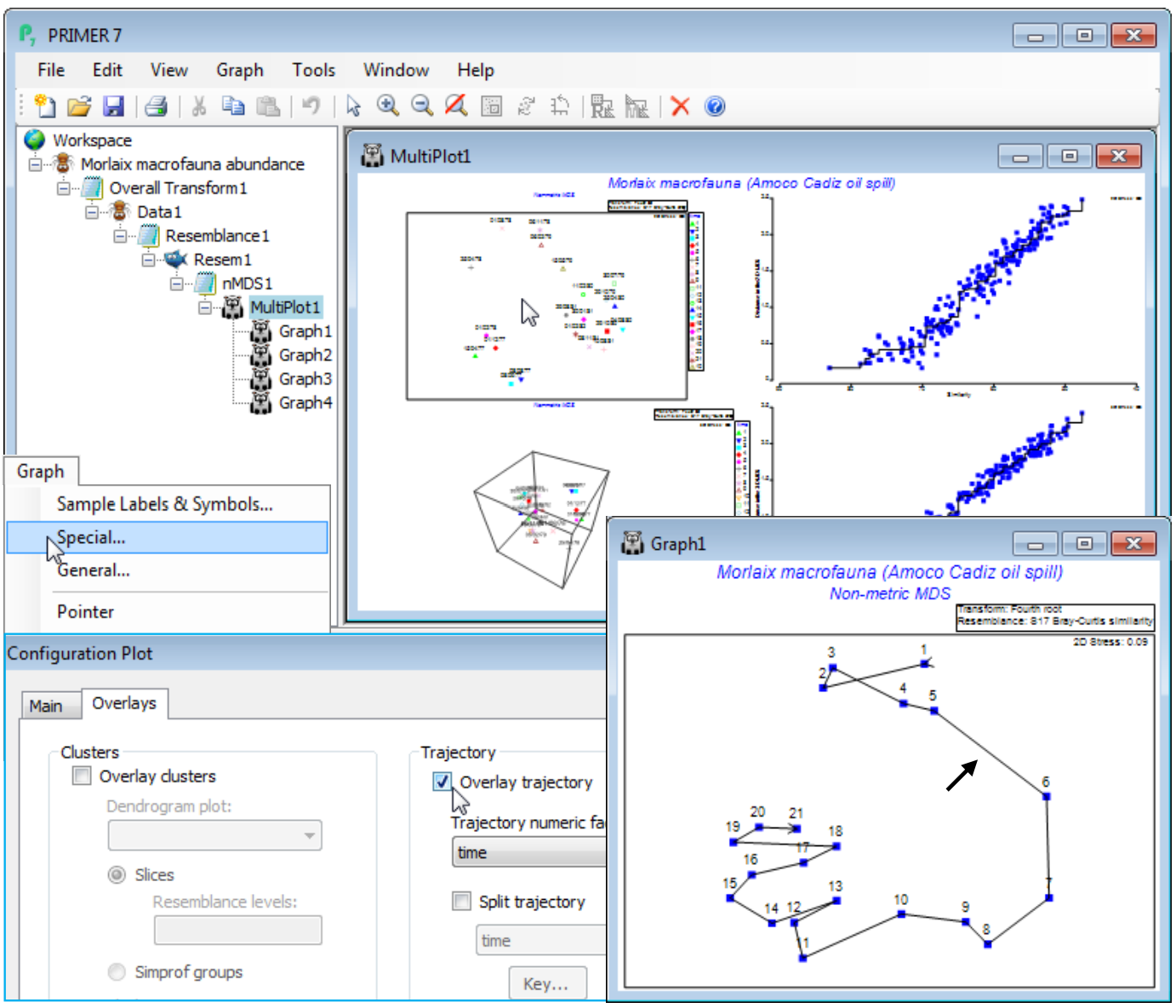
A trajectory joining points on an ordination is simply added using Graph>Special>Overlays and taking the (✓Overlay trajectory) option and supplying a factor name for the trajectory sequence, which of course needs to have purely numeric entries. These do not need to be the integers 1, 2, 3, etc – the rank of the numbers will be used to dictate the connection order. Any blank entries in the factor will be ignored – these points will not be part of the trajectory, but neither do they break a connection to give multiple trajectories. In order to produce the latter, a new (and very useful!) feature in PRIMER 7 is to tick a (✓Split trajectory) check box and supply a second factor name. This is now a categorical factor with differing entries determining the separate trajectories to be drawn, in the same sequence order for all such groups, specified by the first (numeric) factor. A typical example would be an MDS plot of a time series of samples taken at a number of sites, the first factor determining the sampling year (or month or day etc) and the second factor the site name, allowing the time progression to be tracked more clearly on the ordination, in parallel for the sites. A Key button gives access to a standard dialog box which sets the symbol, line type and colour (the same for both symbols and trajectory) for the different groups.
To demonstrate a single time trajectory, open data file Morlaix macrofauna abundance in directory C:\Examples v7\Morlaix macrofauna, and carry out an nMDS in standard fashion, much as for the previous example, except with no sample standardisation and use of a fourth-root transform prior to the Bray-Curtis calculation. Use all the default settings for nMDS to produce the 2-d plot (Graph1), which has low stress of 0.09 (bearing in mind that the original data has 251 species dimensions, many of which enter the similarity computation because of the severe fourth-root transformation!). As above, harmonise the symbols, i.e. on the Samp. labels & symbols tab remove (Symbols✓By factor) and add (Labels✓By factor: time) – also for the below, the General>(Overall font scale) was increased, and you may need to Rotate Data or Flip an axis to obtain the configuration shown. Graph>Special>Overlays>(Trajectory✓Overlay trajectory)>(Trajectory numeric factor:time) then adds the time trajectory and greatly clarifies the interpretation. The first 5 points represent a year’s seasonal cycle prior to the spill (the impact time indicated by the arrow), after which community structure changes strongly over the next year (4 points) before an apparent partial recovery towards the initial community, with the scale of the three seasonal cycles evident for the last three years.

